THE BOULEVARD THEATRE
Credit: SODA Studio
Design: Katie Stamp, Andrew Fish
Brand Strategy – Identity – Art Direction – Stationery
Awards: The Drum Awards / Design Week
Press: Its Nice That
Credit: SODA Studio
Design: Katie Stamp, Andrew Fish
Brand Strategy – Identity – Art Direction – Stationery
Awards: The Drum Awards / Design Week
Press: Its Nice That
CONTEXT
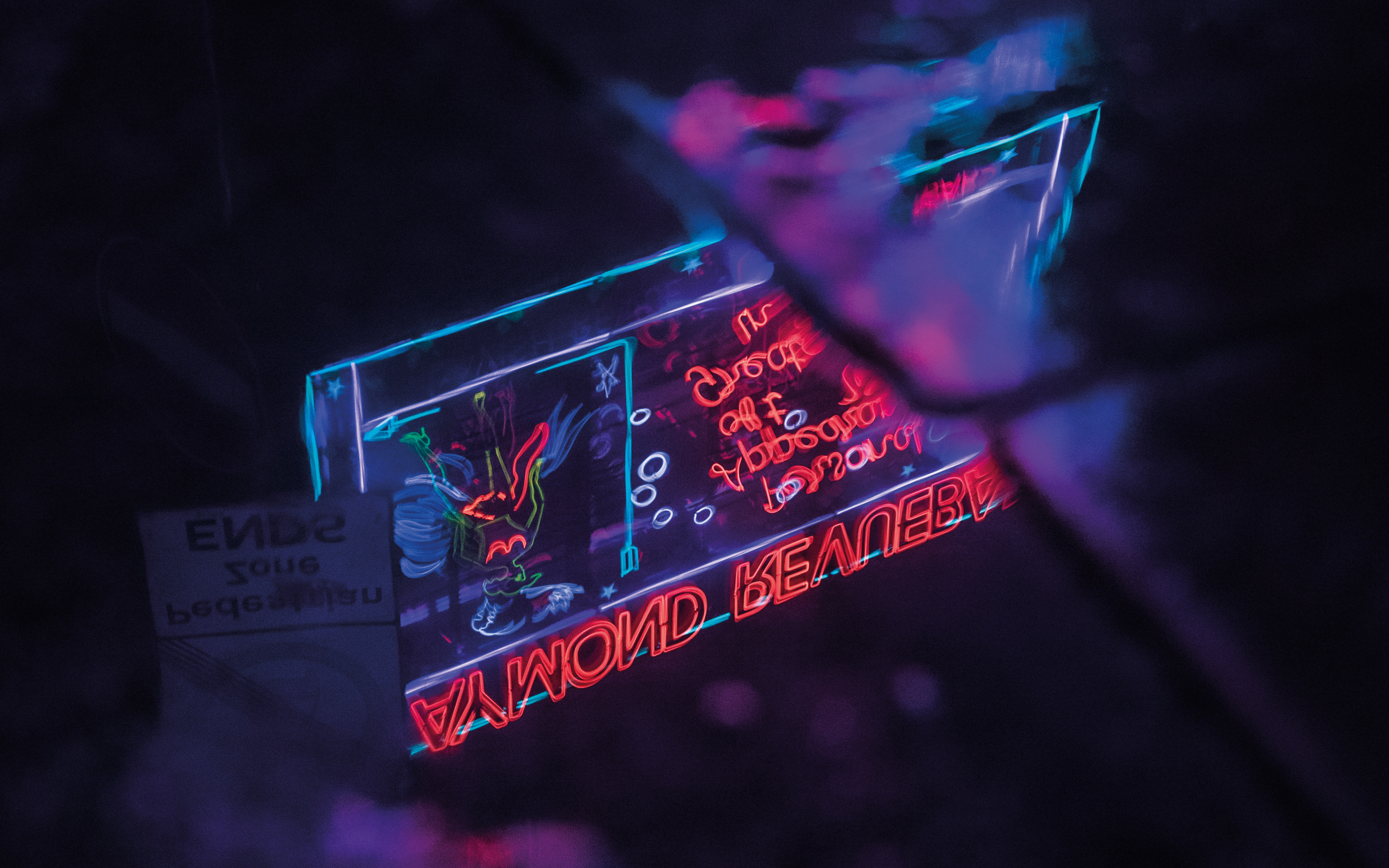
The Boulevard Theatre, which opened in November 2019, may have been Soho’s newest playhouse, but it comes with a much longer, richer history. Originally tucked away in a side room of the infamous Raymond Revuebar—a notorious strip club and brothel—the theatre’s past became the driving force behind its identity.
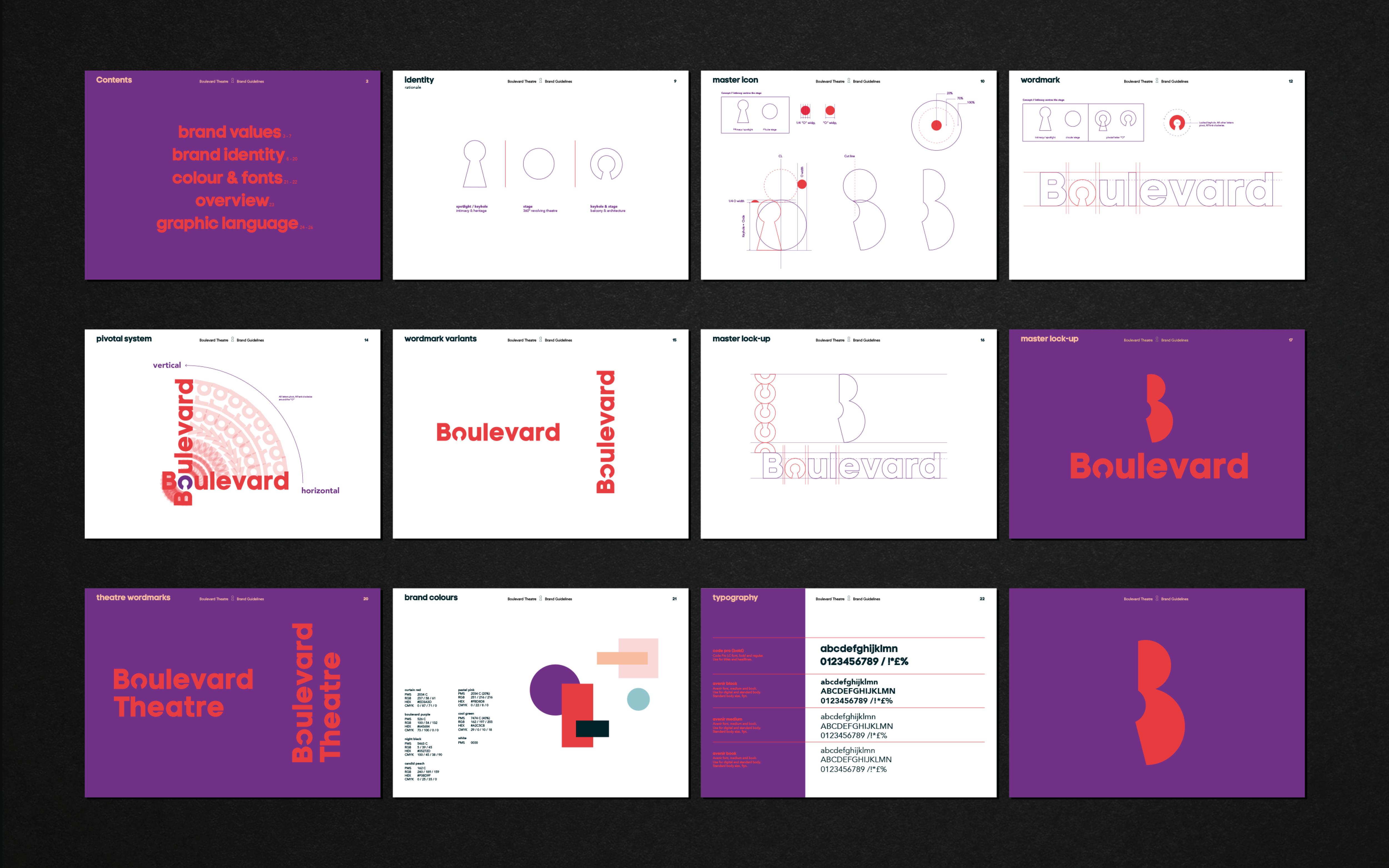
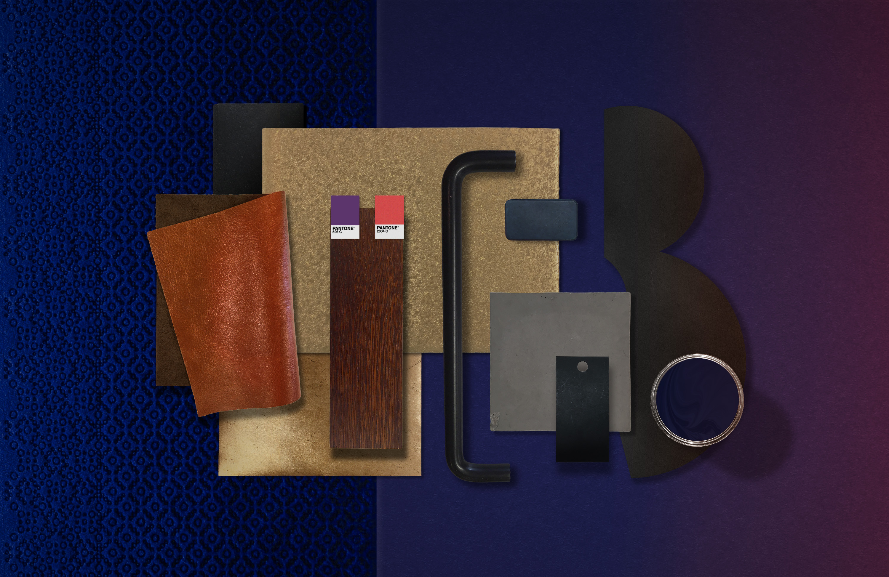
Inspired by its beginnings, the Boulevard Theatre’s branding draws directly from its past. The iconic 'B' logo is designed from two intersecting circles, symbolising the theatre’s layered history. The logo is intercut with a custom keyhole device, subtly referencing the building’s former life as a brothel, while also symbolising a gateway to new stories and performances.
Inspired by its beginnings, the Boulevard Theatre’s branding draws directly from its past. The iconic 'B' logo is designed from two intersecting circles, symbolising the theatre’s layered history. The logo is intercut with a custom keyhole device, subtly referencing the building’s former life as a brothel, while also symbolising a gateway to new stories and performances.


SOLUTION
This identity bridges the past and present of the Boulevard Theatre. While we aimed to honor its historical significance, we also wanted a contemporary mark reflecting the 360º revolving stage. The keyhole was used as a visual strategy to evoke the theatre’s intimate and close-up performance style. However, despite being a strong symbol of the theatre's legacy, it wasn’t intended to dominate the design. Instead, we explored stacking circles to form the letter 'B,' creatively intersecting the keyhole to craft a distinct custom mark.
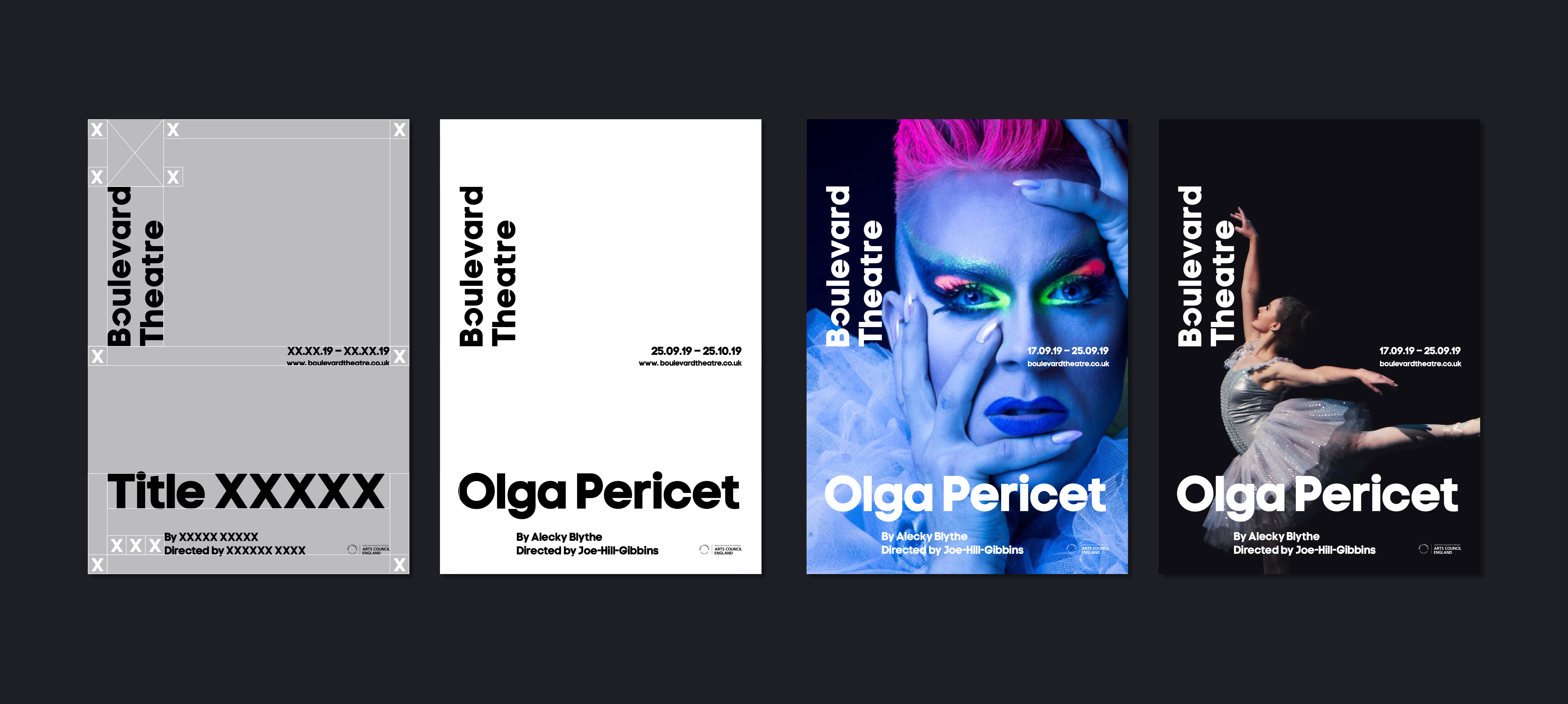
This design language flows seamlessly into the Boulevard wordmark, where the keyhole sits prominently within the letter "o." Acting as a pivotal element, it anchors the typography, allowing for flexible alignment both vertically and horizontally, embodying the theatre's versatile space. The circular motif from the logo also inspired the rotating auditorium balcony, blending architectural and graphic design.
This design language flows seamlessly into the Boulevard wordmark, where the keyhole sits prominently within the letter "o." Acting as a pivotal element, it anchors the typography, allowing for flexible alignment both vertically and horizontally, embodying the theatre's versatile space. The circular motif from the logo also inspired the rotating auditorium balcony, blending architectural and graphic design.