BIIND MUSIC APP
Credit: AOK Studio
Design: Katie Stamp, Ahmed Abokor
Motion: Josha Eiffel
Brand Identity – Art Direction
Credit: AOK Studio
Design: Katie Stamp, Ahmed Abokor
Motion: Josha Eiffel
Brand Identity – Art Direction
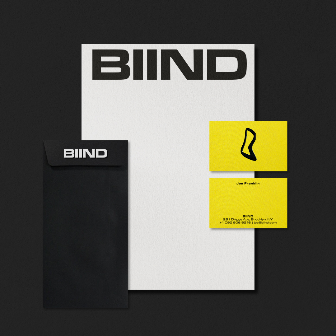
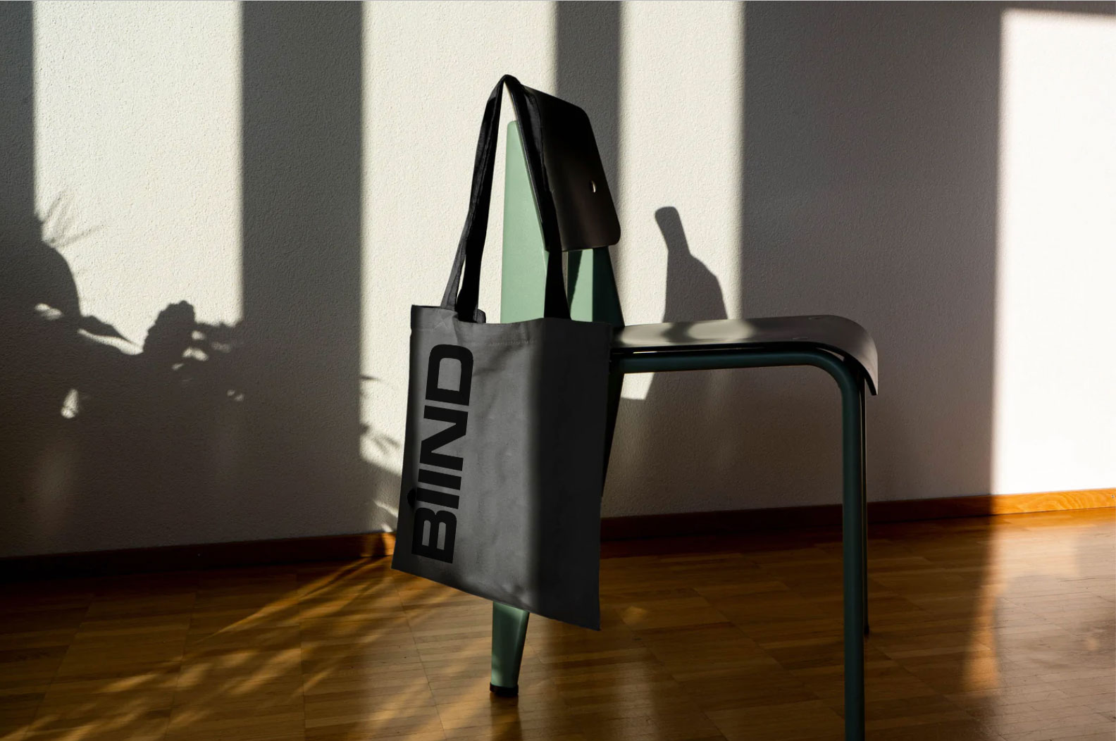
CONTEXT
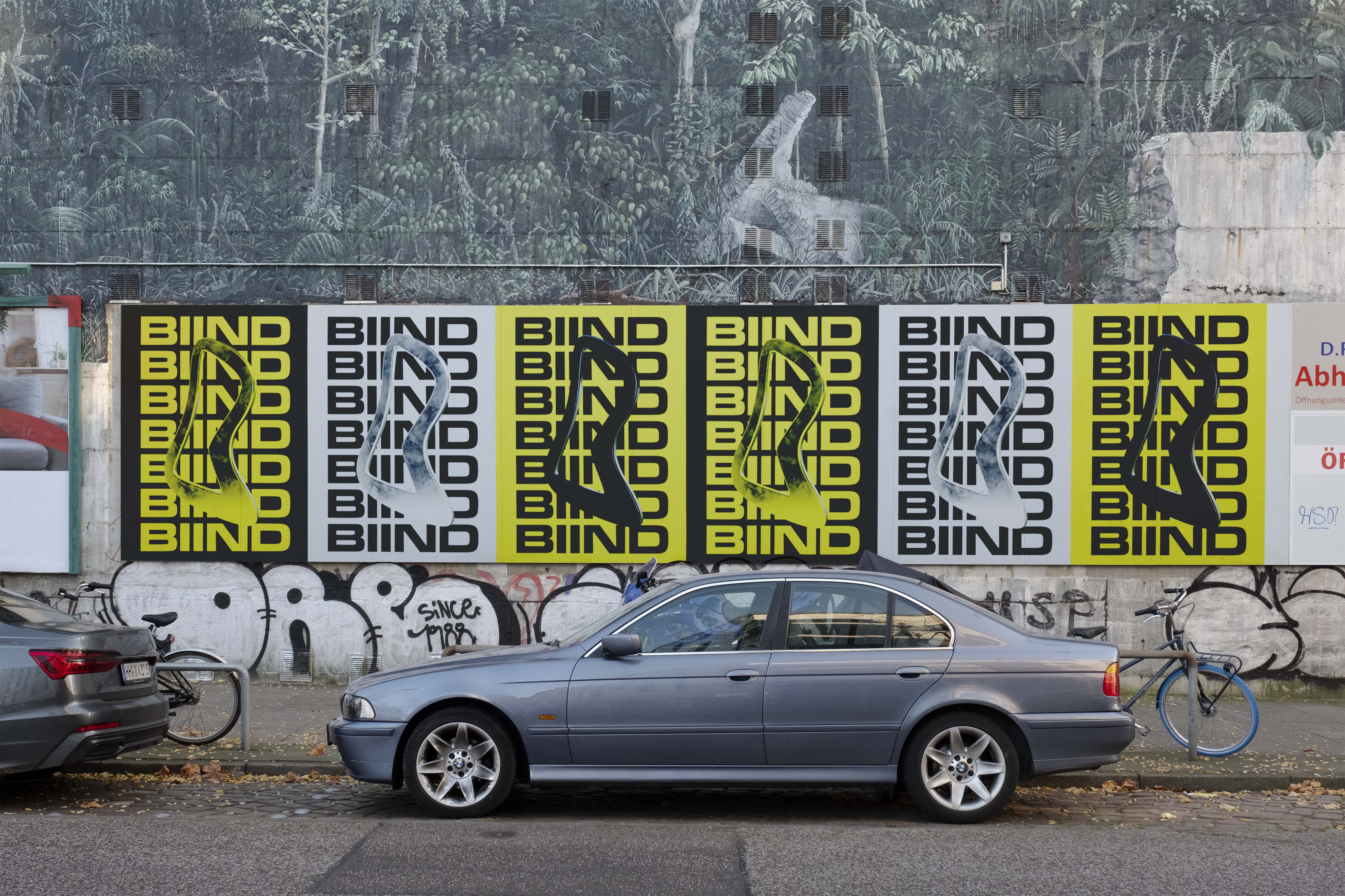
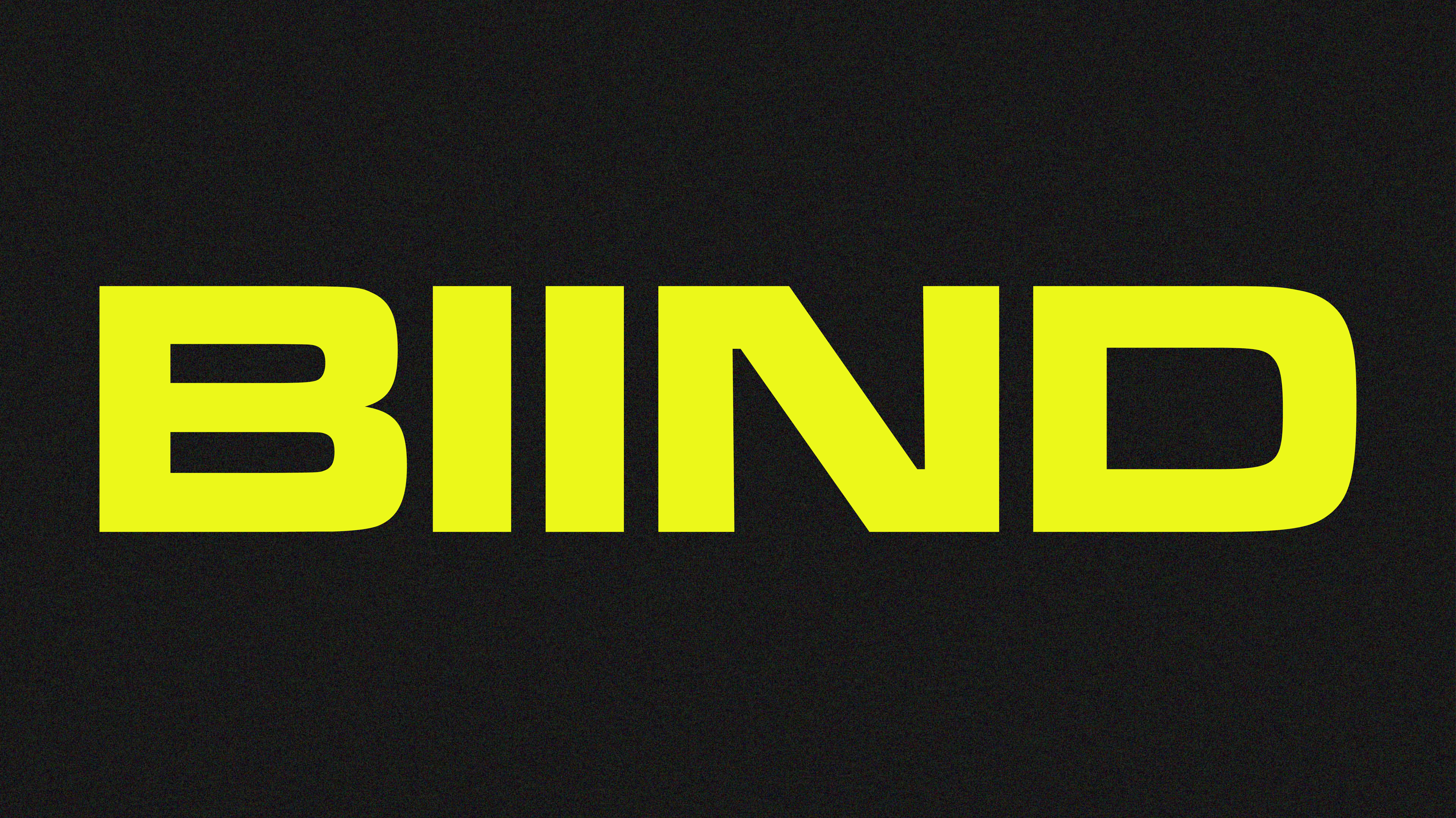
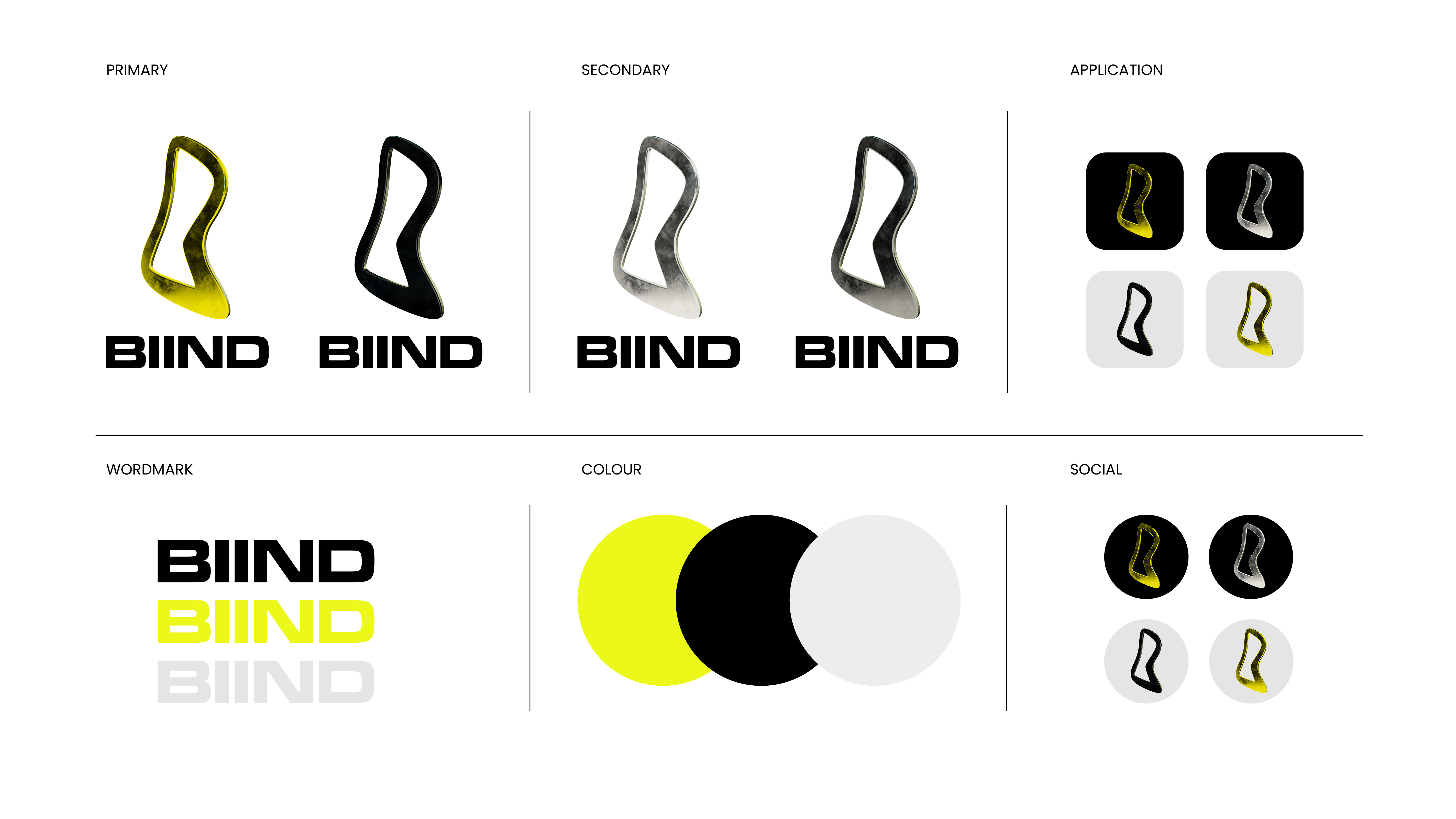
Biind is a pre-seed stage start-up, providing a new digital streaming platform. The aim, to revolutionise the way emerging artists gain exposure and how consumers discover fresh talent. AOK created a brand identity that not only challenged the market, but that functions as a symbol for the underground. Empowering emerging talent and celebrating the power of free-thinking, experimentation and independence.
Biind is a pre-seed stage start-up, providing a new digital streaming platform. The aim, to revolutionise the way emerging artists gain exposure and how consumers discover fresh talent. AOK created a brand identity that not only challenged the market, but that functions as a symbol for the underground. Empowering emerging talent and celebrating the power of free-thinking, experimentation and independence.


SOLUTION
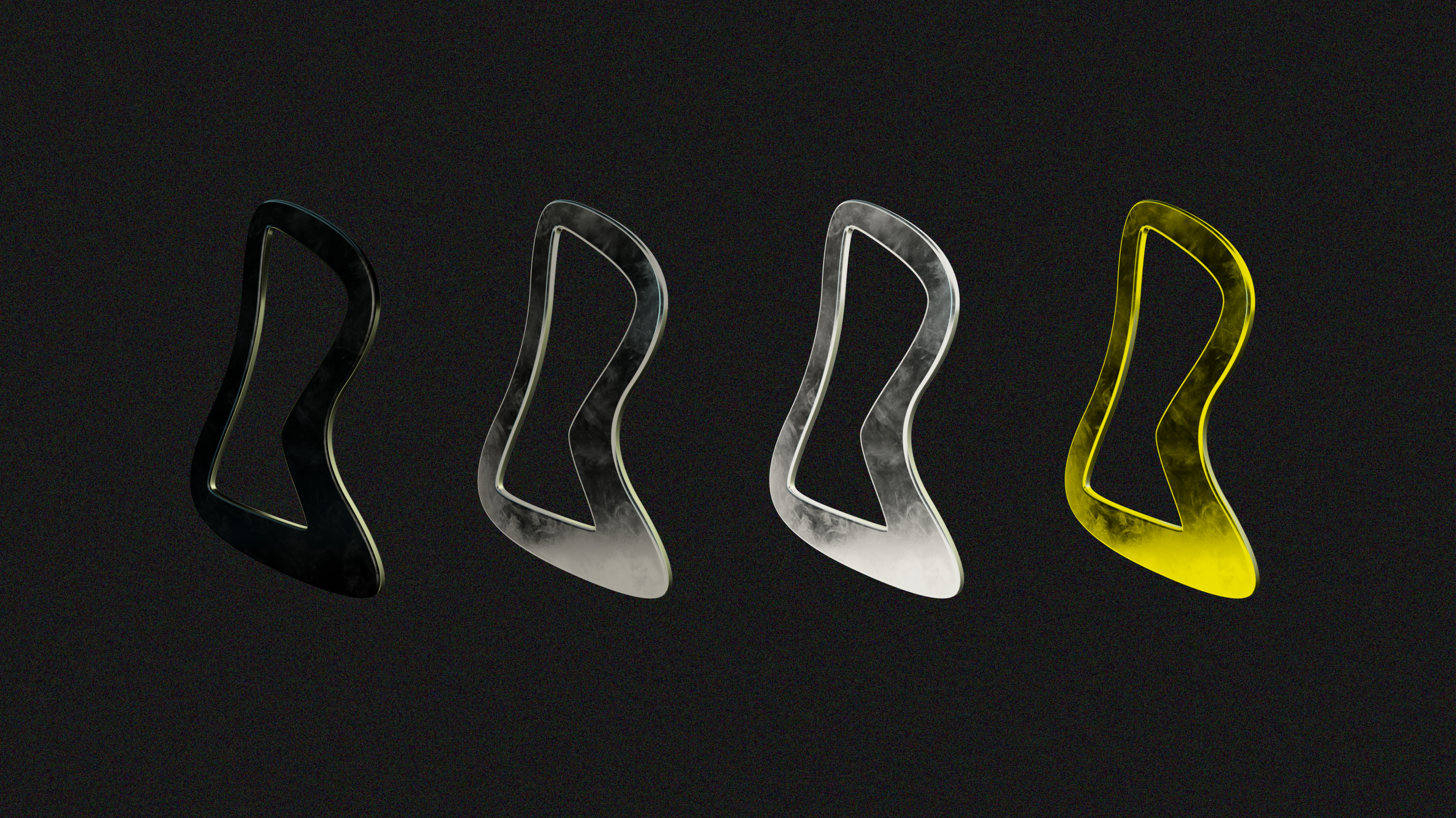
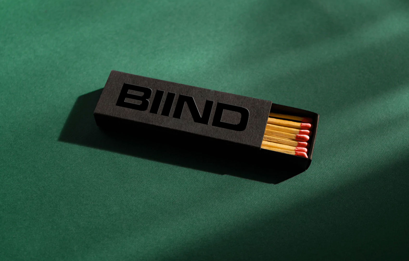
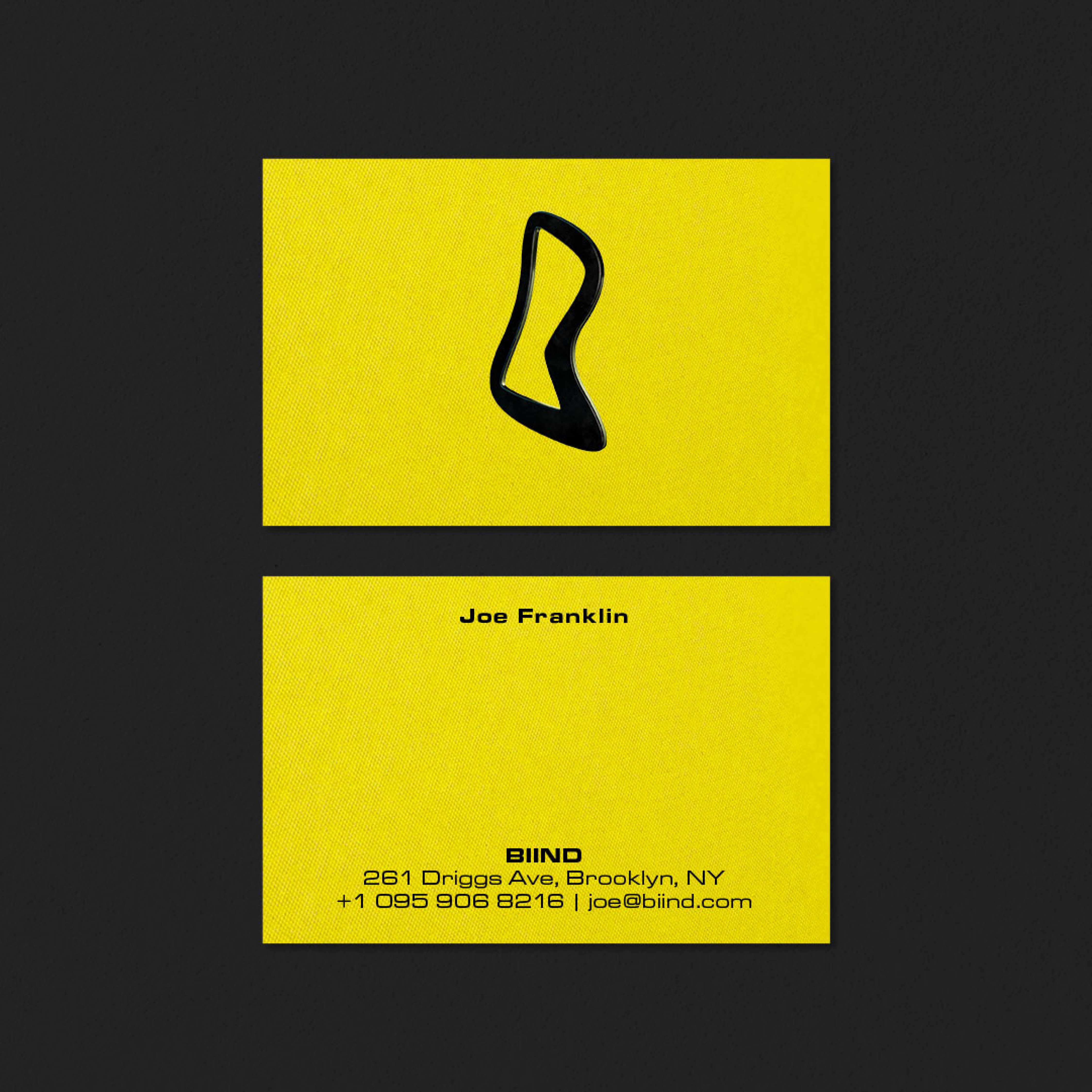
It was time to rewrite the agenda, not just to be anti-establishment, but to be active in driving true change within the music industry. We created a wordmark with unapologetic weight, heavy and recognisable. This bold, blocky nature was balanced by the fluid icon, which was hand drawn to capture the imperfections of art and the organic expression of music making. Metallic materials were used to show the permanence, strength and reflection of the brand and the legacy it stands for.

SOPHIE GRIFFITHS ARCHITECTS
Design: Katie Stamp
Motion: Liam Nash
Brand Identity – Art Direction – Stationery – Website
Design: Katie Stamp
Motion: Liam Nash
Brand Identity – Art Direction – Stationery – Website
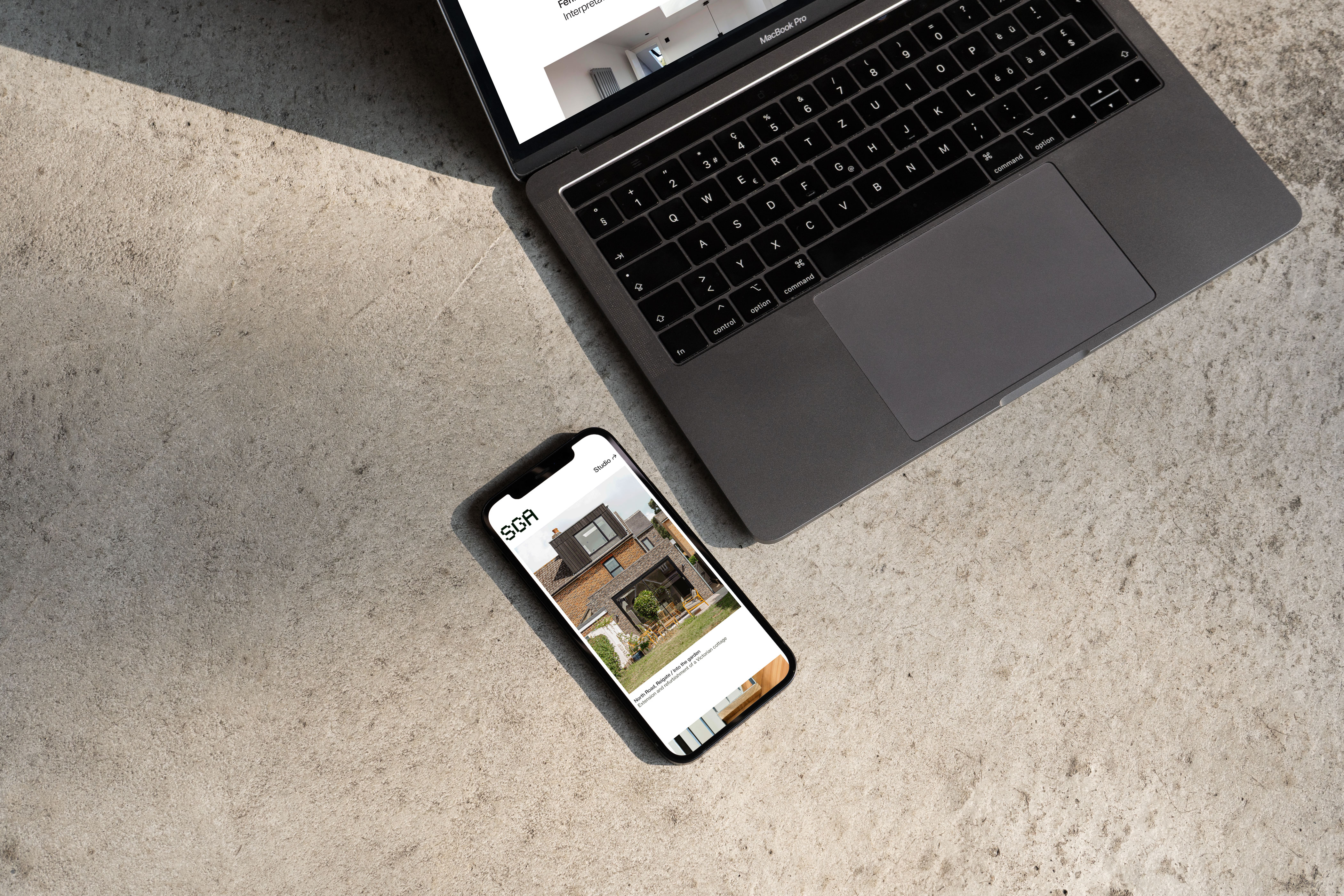
CONTEXT
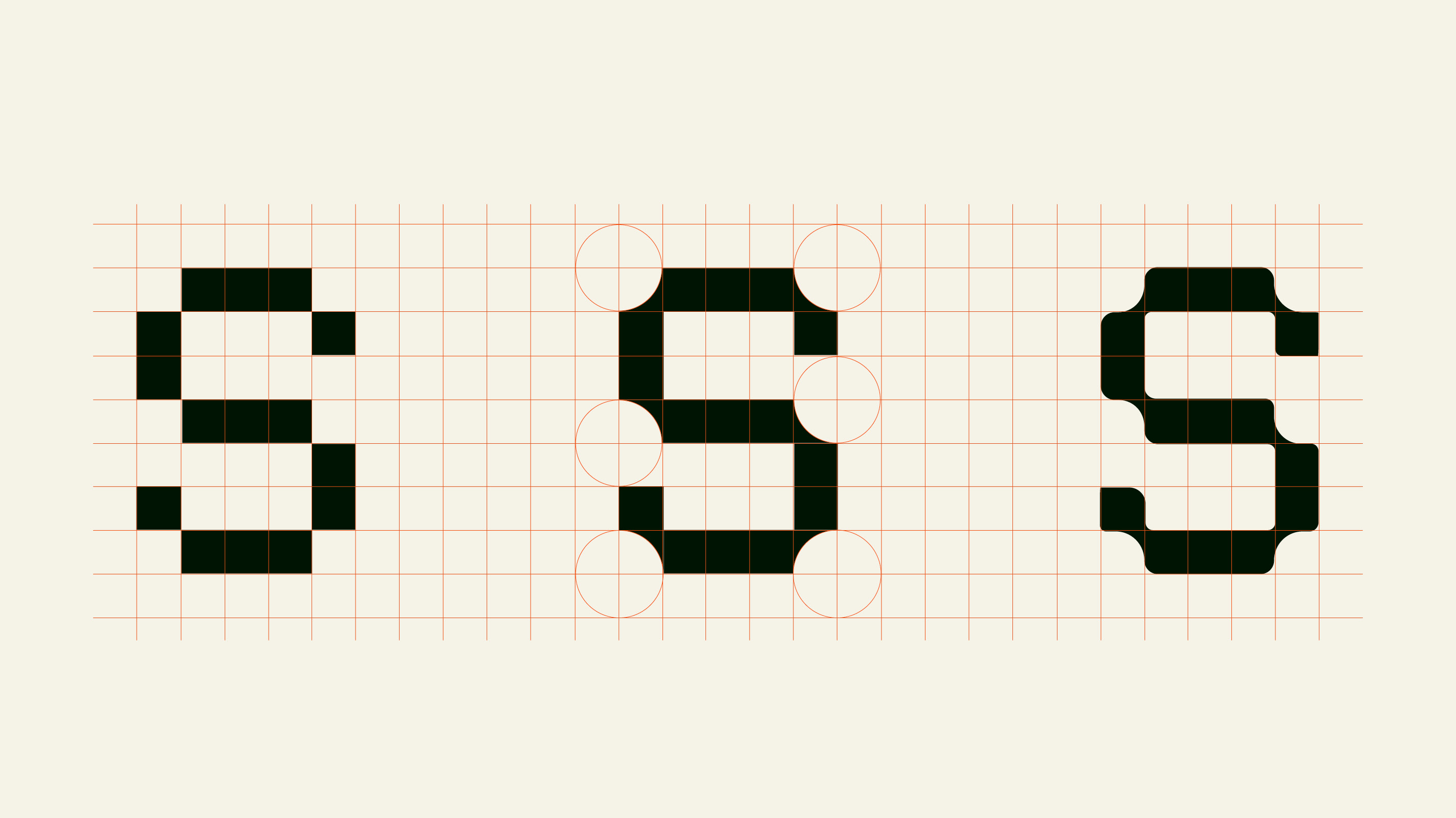
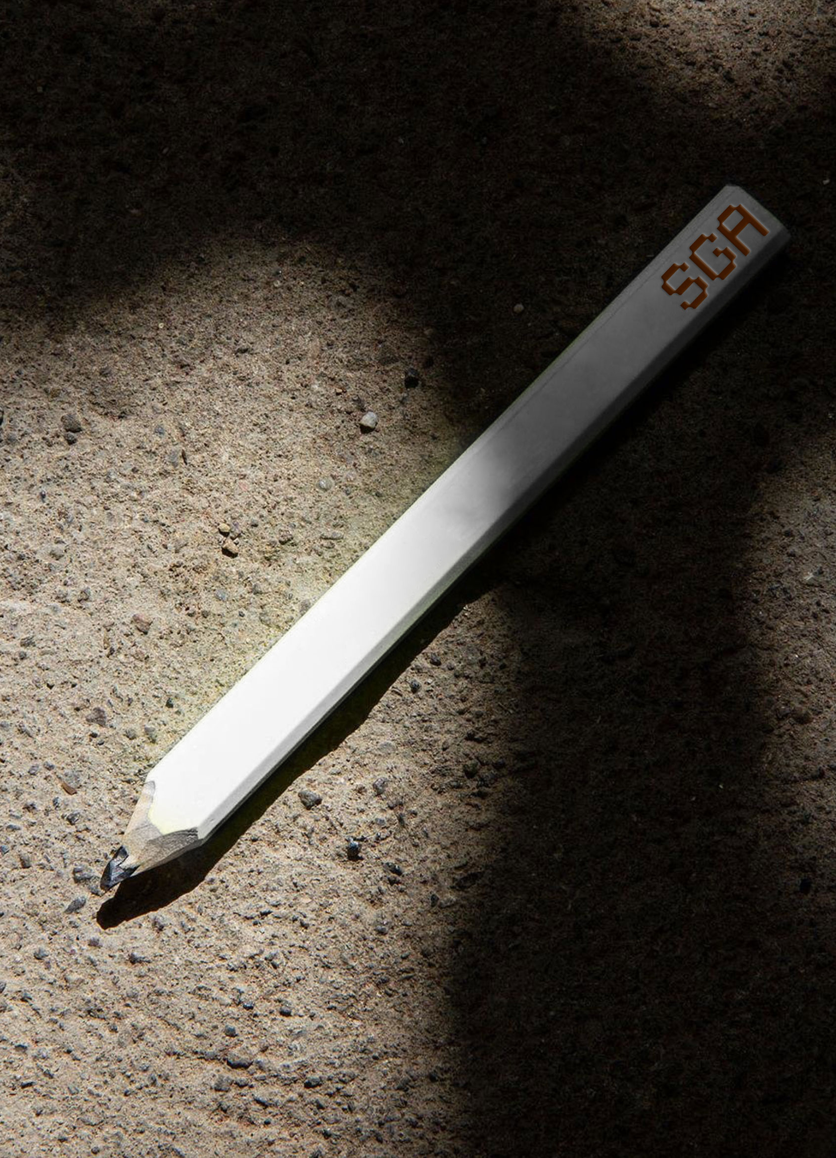
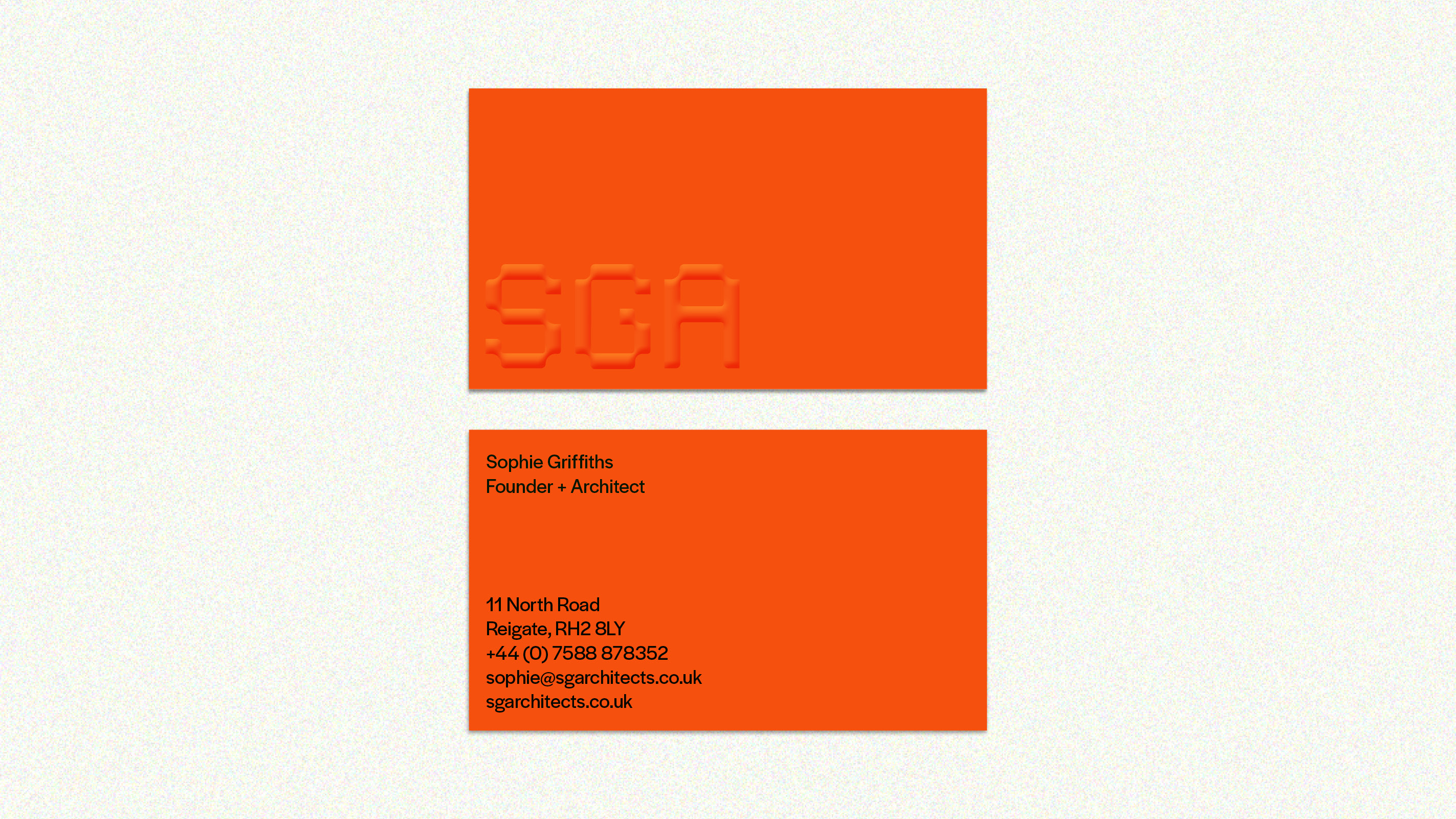
Sophie Griffiths Architects believes that impactful architecture transforms lives. The studio’s rebrand, developed in close collaboration with founder Sophie Griffiths, aimed to embody this philosophy. Through iterative workshops, we crafted an identity that highlights SGA’s commitment to strong, independent design.
The rebrand features custom lettering that symbolises connection, structure, and fluidity, reflecting SGA’s dedication to meaningful, emotionally resonant design.
The rebrand features custom lettering that symbolises connection, structure, and fluidity, reflecting SGA’s dedication to meaningful, emotionally resonant design.


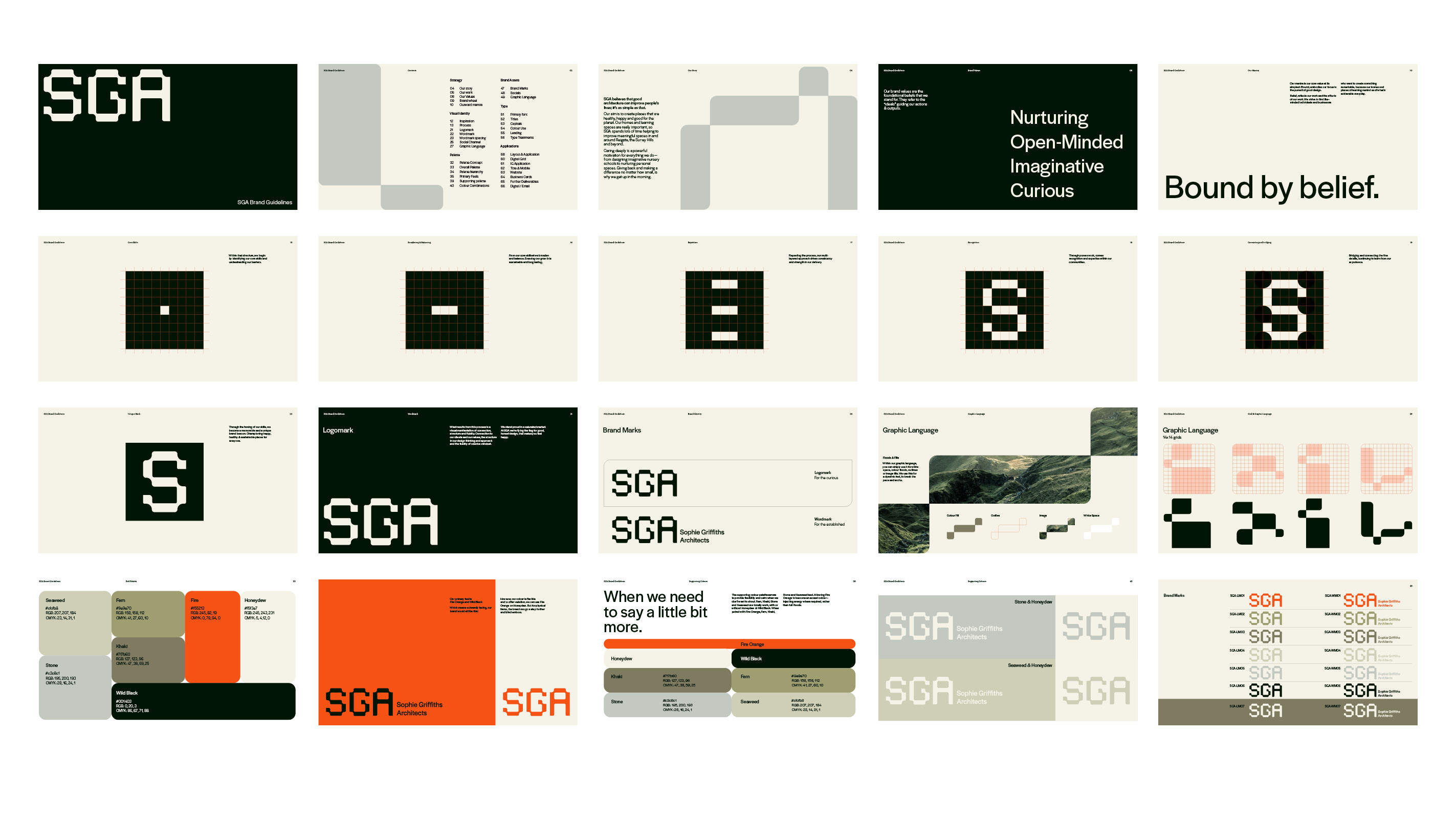

SOLUTION
It was time to rewrite the agenda, not just to be anti-establishment, but to be active in driving true change within the music industry. We created a wordmark with unapologetic weight, heavy and recognisable. This bold, blocky nature was balanced by the fluid icon, which was hand drawn to capture the imperfections of art and the organic expression of music making. Metallic materials were used to show the permanence, strength and reflection of the brand and the legacy it stands for.


SESSIONS ARTS CLUB
Credit: SODA Studio
Design: Katie Stamp, Andrew Fish
3D: Matt Gilbert
Finishing: Dot Studio
Website: Katie Stamp
Brand Identity – Art Direction – Stationery – Menu Design
Credit: SODA Studio
Design: Katie Stamp, Andrew Fish
3D: Matt Gilbert
Finishing: Dot Studio
Website: Katie Stamp
Brand Identity – Art Direction – Stationery – Menu Design
CONTEXT
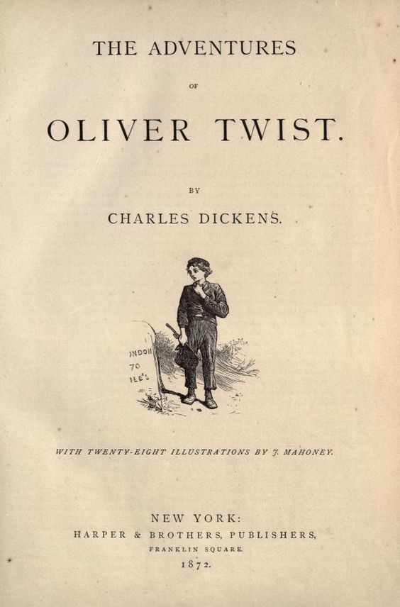
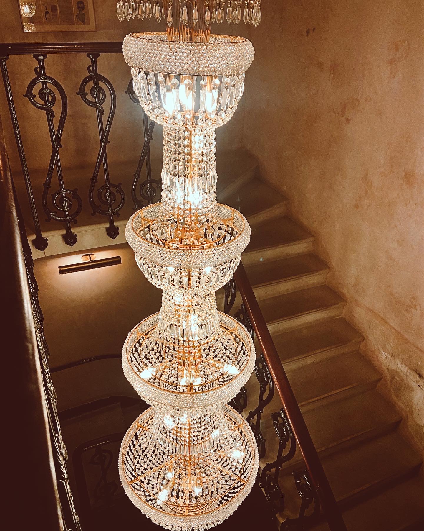
Nestled within the historic, Grade II* listed Old Sessions House, Sessions Arts Club offers an immersive sensory experience, blending food, music, design, and architecture. The restaurant’s identity is deeply intertwined with the building’s rich history, dating back to 1782 when it opened as Middlesex Sessions House, once the largest courthouse in the country. Charles Dickens himself referenced it in Oliver Twist, recounting the pickpocketing that occurred on its steps.
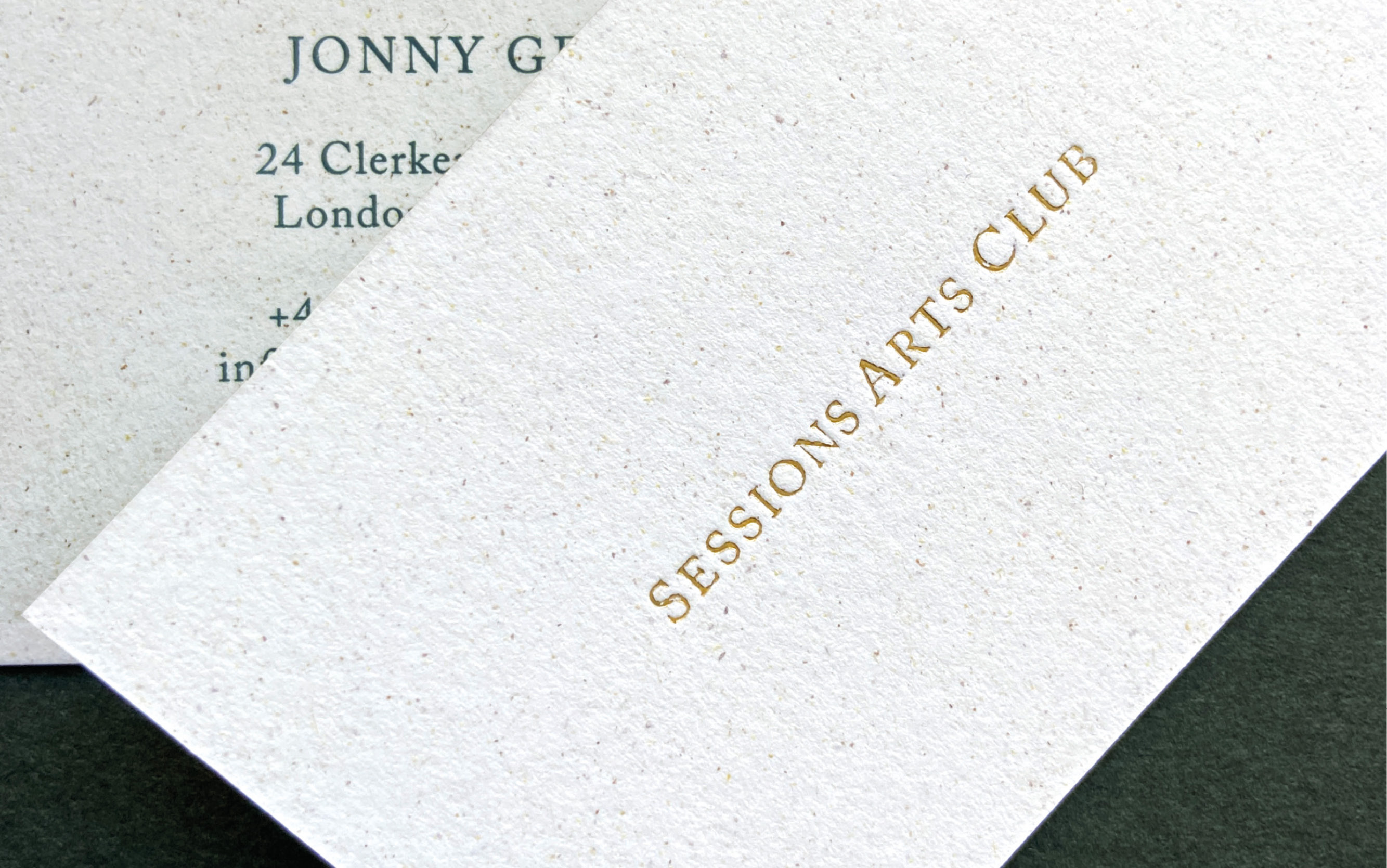
To honour this heritage, SAC’s wordmark draws inspiration from the typesetting of Dickens’ novel, using the classic serif font Caslon in uppercase to evoke a timeless quality. Alongside the wordmark, we developed a monogram that serves as a more discreet and abstract symbol for the restaurant, embodying its subtle elegance. The monogram, with its understated form, becomes a mark that is quietly woven into the visual identity, enhancing the sense of discovery that SAC is known for.
This hidden charm is central to the SAC brand. Much like the restaurant itself, tucked away within Clerkenwell, the brand mark can be found hidden in plain sight for those keen enough to look. It’s a nod to the mystery and allure that runs through both the branding and the experience SAC offers.


MORE
In keeping with the restaurant’s celebration of the arts, all collateral and wayfinding at Sessions Arts Club was crafted using traditional, artisanal techniques. The menus were elevated with the timeless sophistication of antique gold foil blocking, adding a touch of elegance that aligns with the venue’s historic surroundings. Meanwhile, the signage was meticulously hand-painted, infusing the space with a bespoke quality that transforms every corner into a work of art.
These thoughtful details not only honour the building’s legacy but also enhance the overall atmosphere, turning the restaurant into a living, breathing masterpiece where design, craftsmanship, and history converge.
These thoughtful details not only honour the building’s legacy but also enhance the overall atmosphere, turning the restaurant into a living, breathing masterpiece where design, craftsmanship, and history converge.


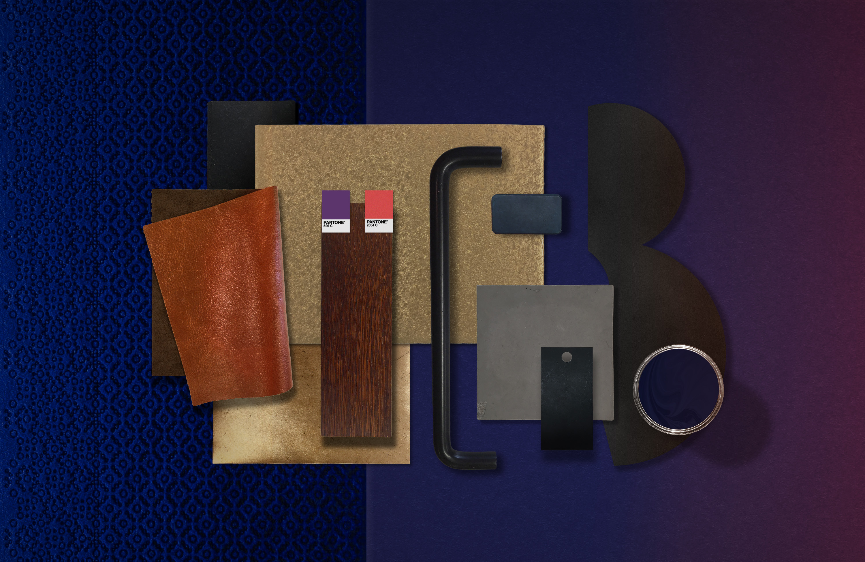
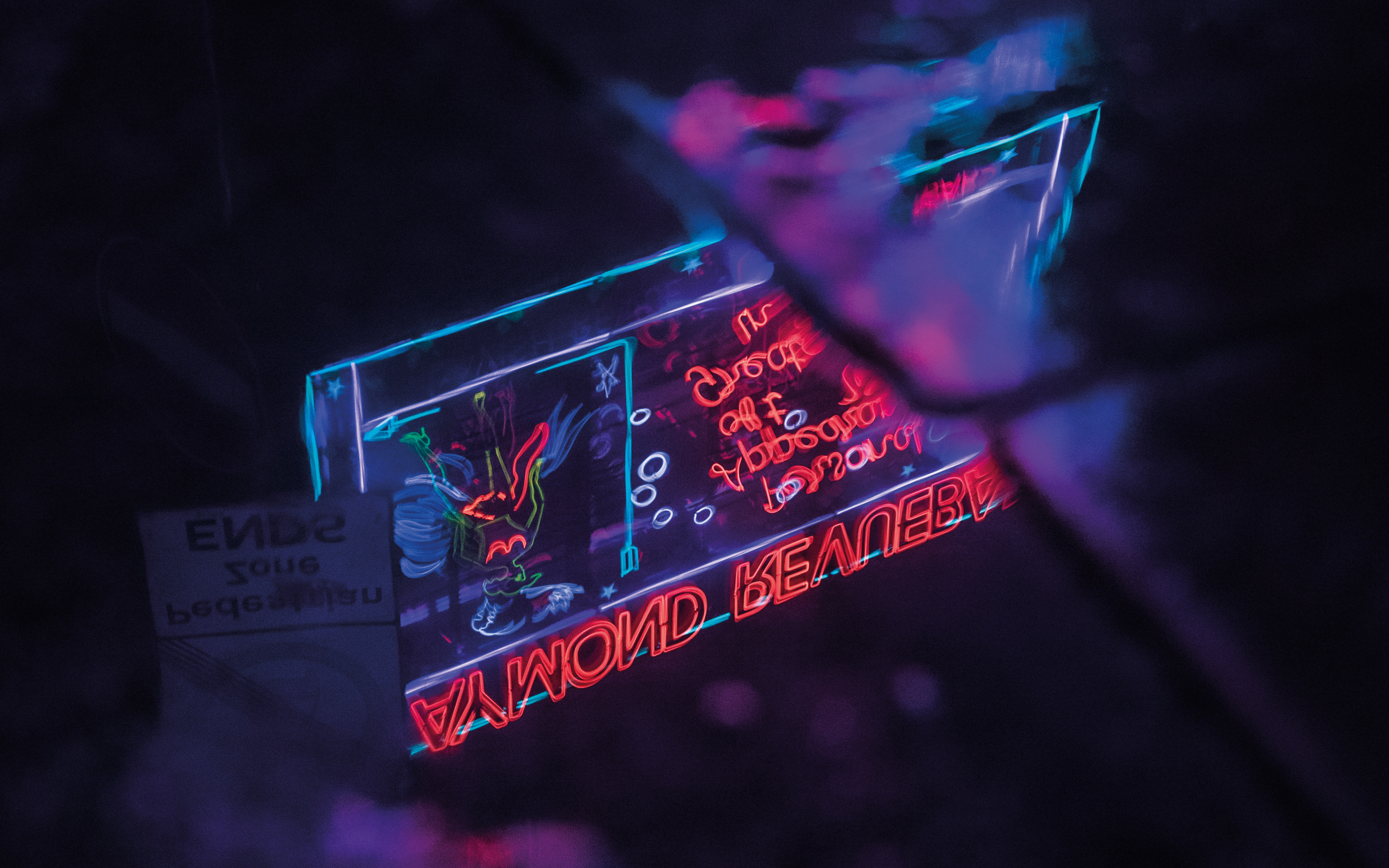
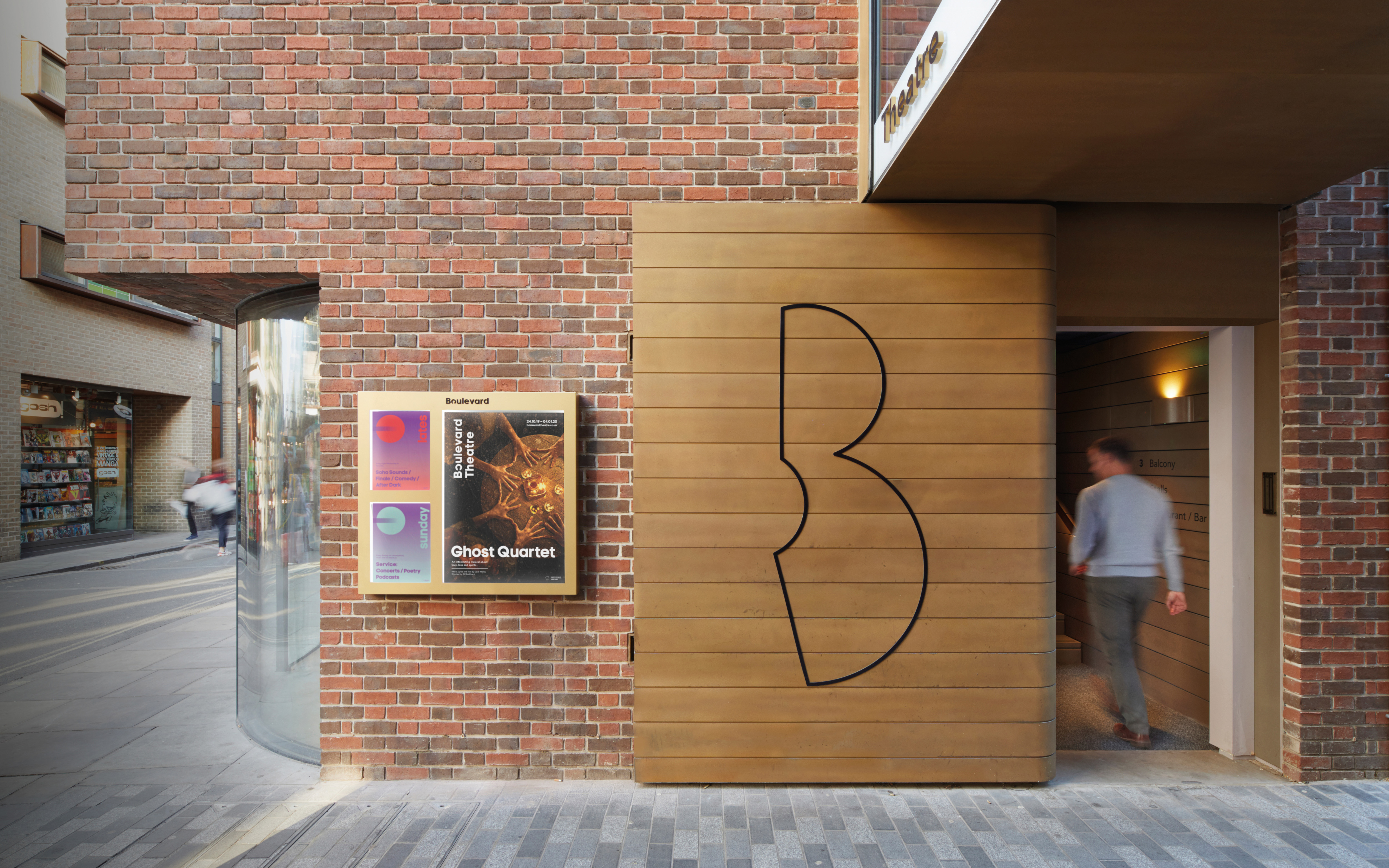
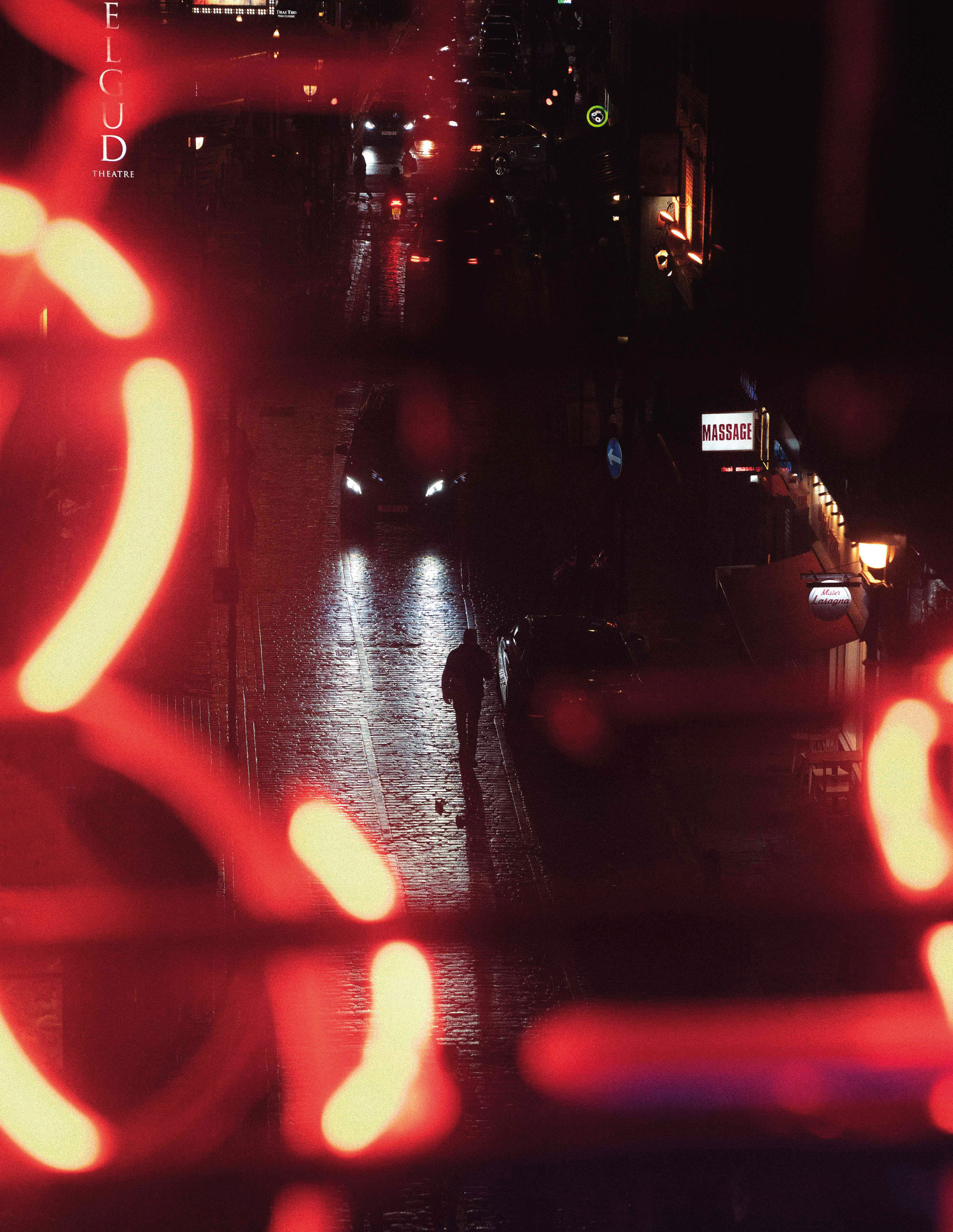
THE BOULEVARD THEATRE
Credit: SODA Studio
Design: Katie Stamp, Andrew Fish
Brand Strategy – Identity – Art Direction – Stationery
Awards: The Drum Awards / Design Week
Press: Its Nice That
Credit: SODA Studio
Design: Katie Stamp, Andrew Fish
Brand Strategy – Identity – Art Direction – Stationery
Awards: The Drum Awards / Design Week
Press: Its Nice That
CONTEXT
The Boulevard Theatre, which opened in November 2019, may have been Soho’s newest playhouse, but it comes with a much longer, richer history. Originally tucked away in a side room of the infamous Raymond Revuebar—a notorious strip club and brothel—the theatre’s past became the driving force behind its identity.
Inspired by its beginnings, the Boulevard Theatre’s branding draws directly from its past. The iconic 'B' logo is designed from two intersecting circles, symbolising the theatre’s layered history. The logo is intercut with a custom keyhole device, subtly referencing the building’s former life as a brothel, while also symbolising a gateway to new stories and performances.
Inspired by its beginnings, the Boulevard Theatre’s branding draws directly from its past. The iconic 'B' logo is designed from two intersecting circles, symbolising the theatre’s layered history. The logo is intercut with a custom keyhole device, subtly referencing the building’s former life as a brothel, while also symbolising a gateway to new stories and performances.


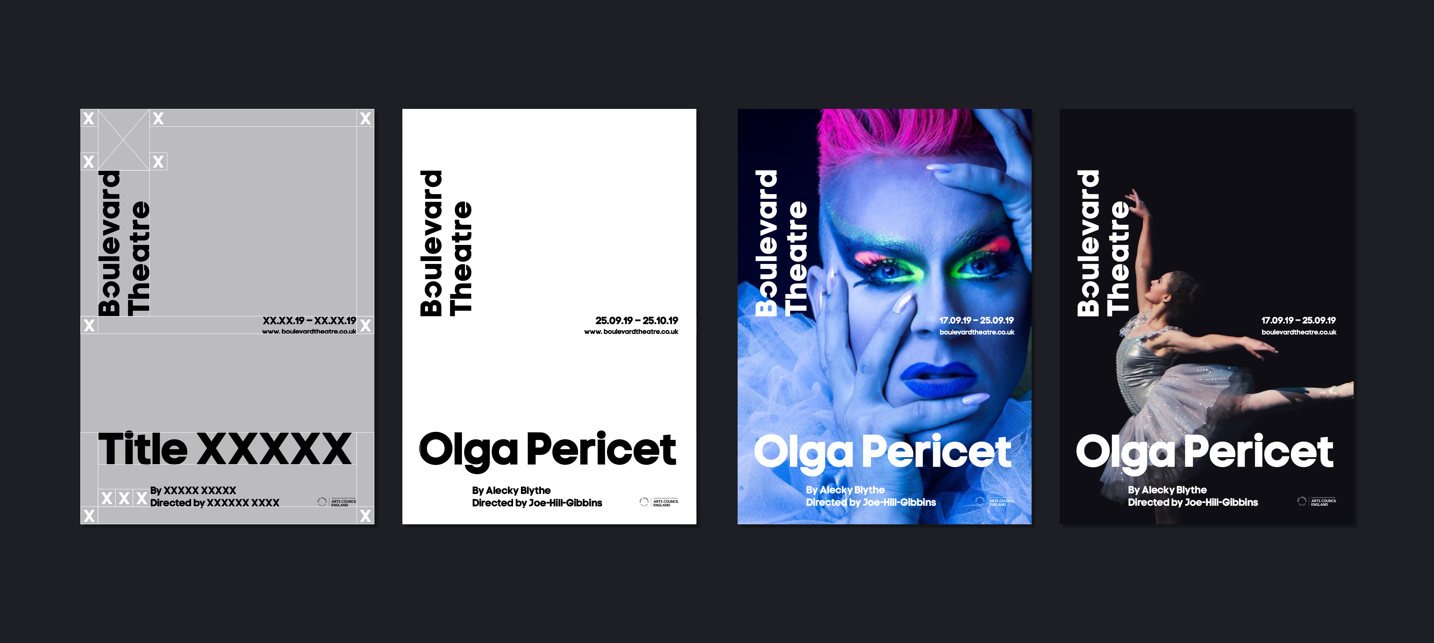


SOLUTION
This identity bridges the past and present of the Boulevard Theatre. While we aimed to honor its historical significance, we also wanted a contemporary mark reflecting the 360º revolving stage. The keyhole was used as a visual strategy to evoke the theatre’s intimate and close-up performance style. However, despite being a strong symbol of the theatre's legacy, it wasn’t intended to dominate the design. Instead, we explored stacking circles to form the letter 'B,' creatively intersecting the keyhole to craft a distinct custom mark.
This design language flows seamlessly into the Boulevard wordmark, where the keyhole sits prominently within the letter "o." Acting as a pivotal element, it anchors the typography, allowing for flexible alignment both vertically and horizontally, embodying the theatre's versatile space. The circular motif from the logo also inspired the rotating auditorium balcony, blending architectural and graphic design.
This design language flows seamlessly into the Boulevard wordmark, where the keyhole sits prominently within the letter "o." Acting as a pivotal element, it anchors the typography, allowing for flexible alignment both vertically and horizontally, embodying the theatre's versatile space. The circular motif from the logo also inspired the rotating auditorium balcony, blending architectural and graphic design.

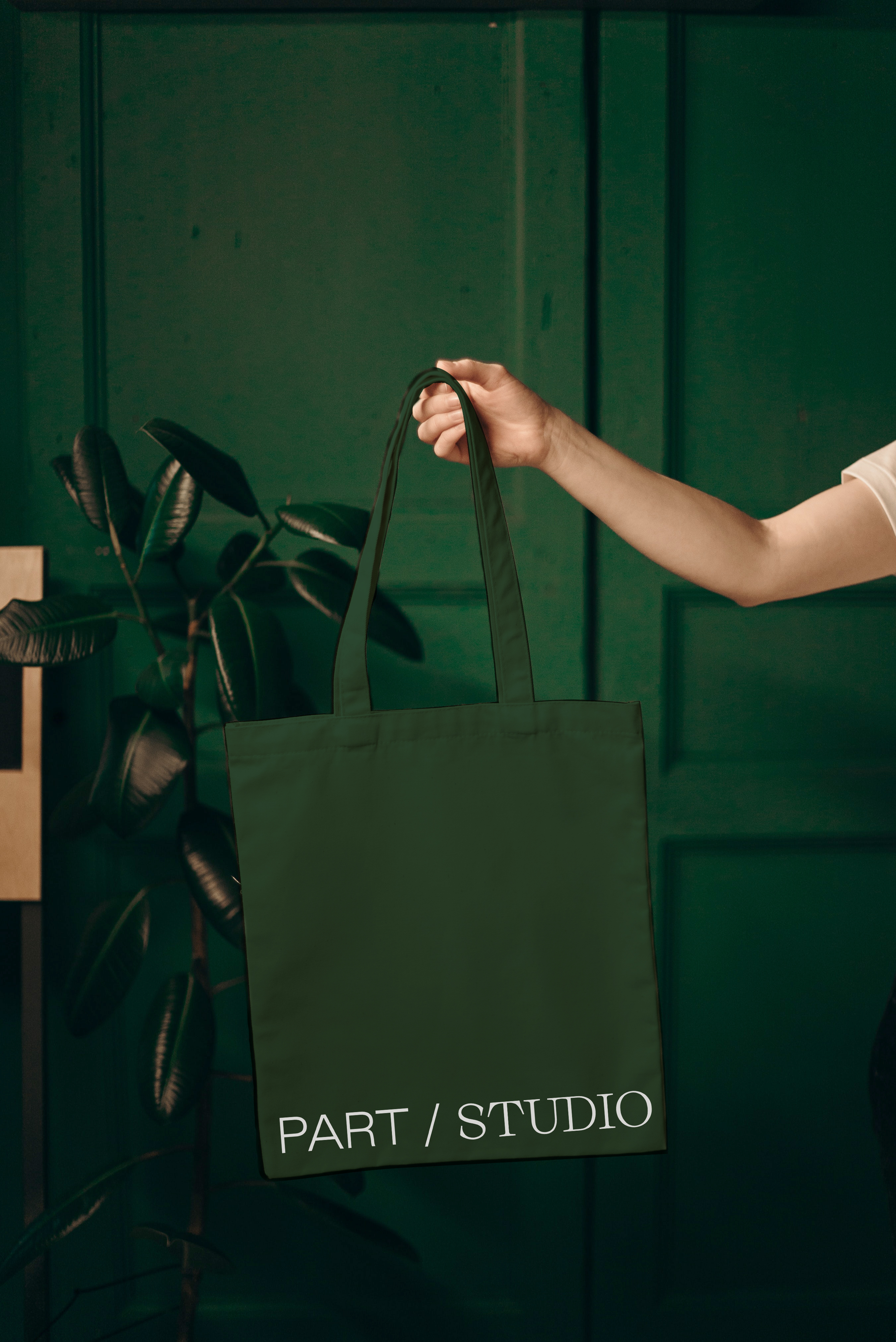
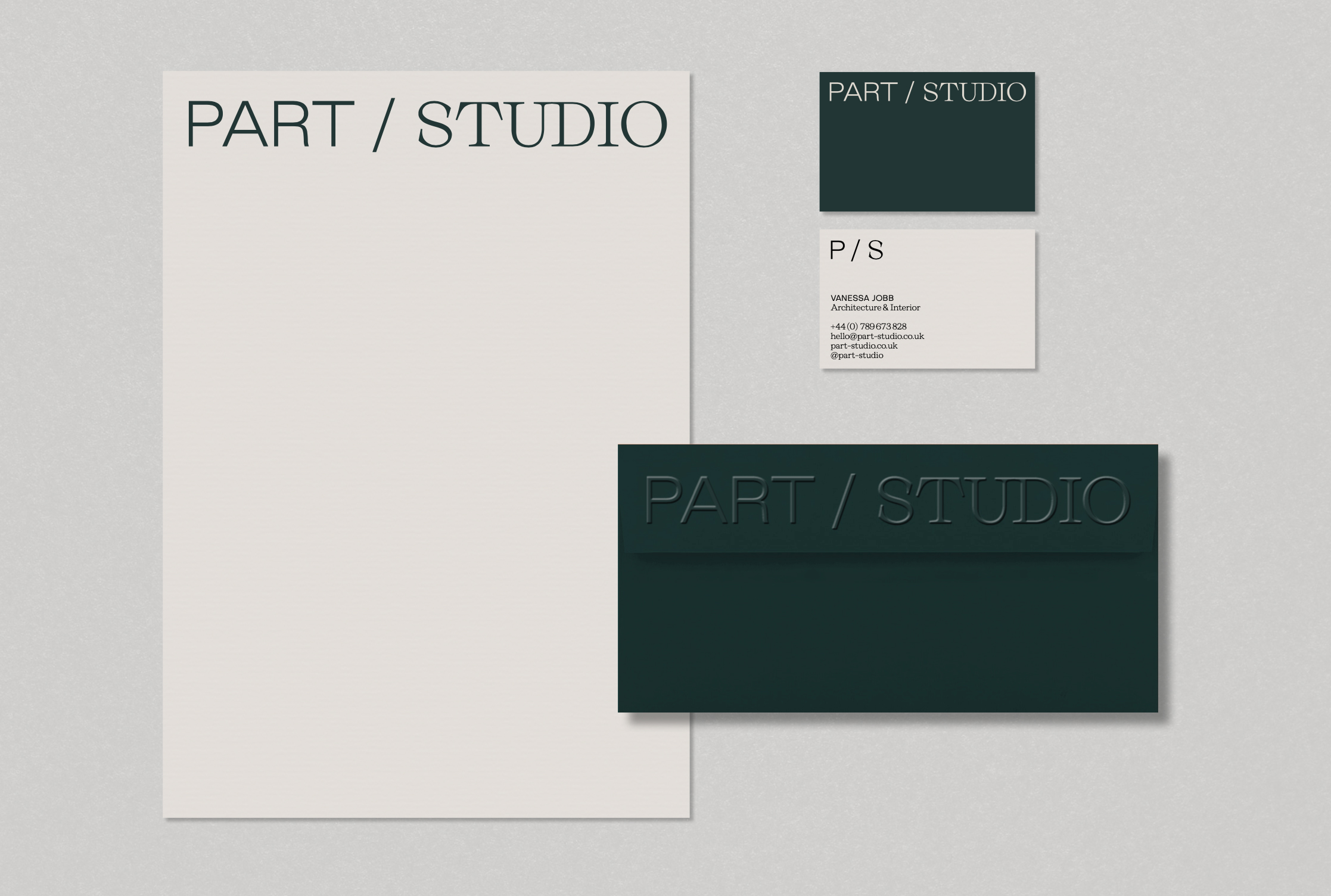
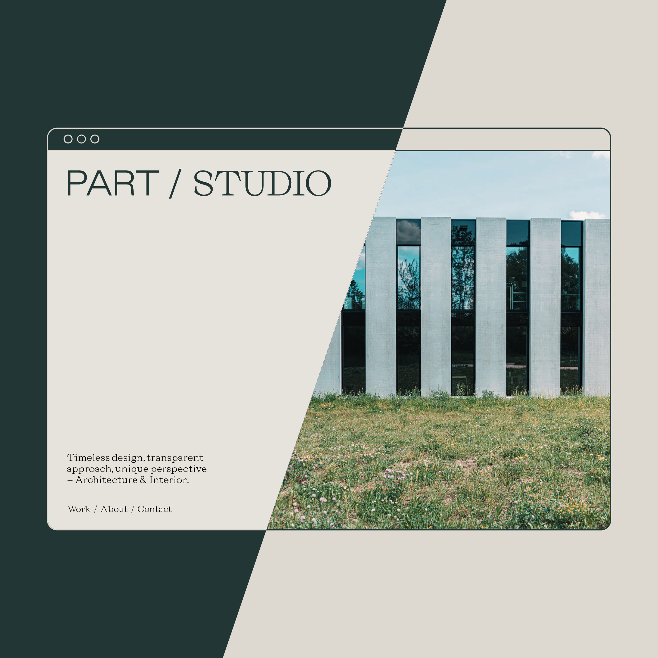
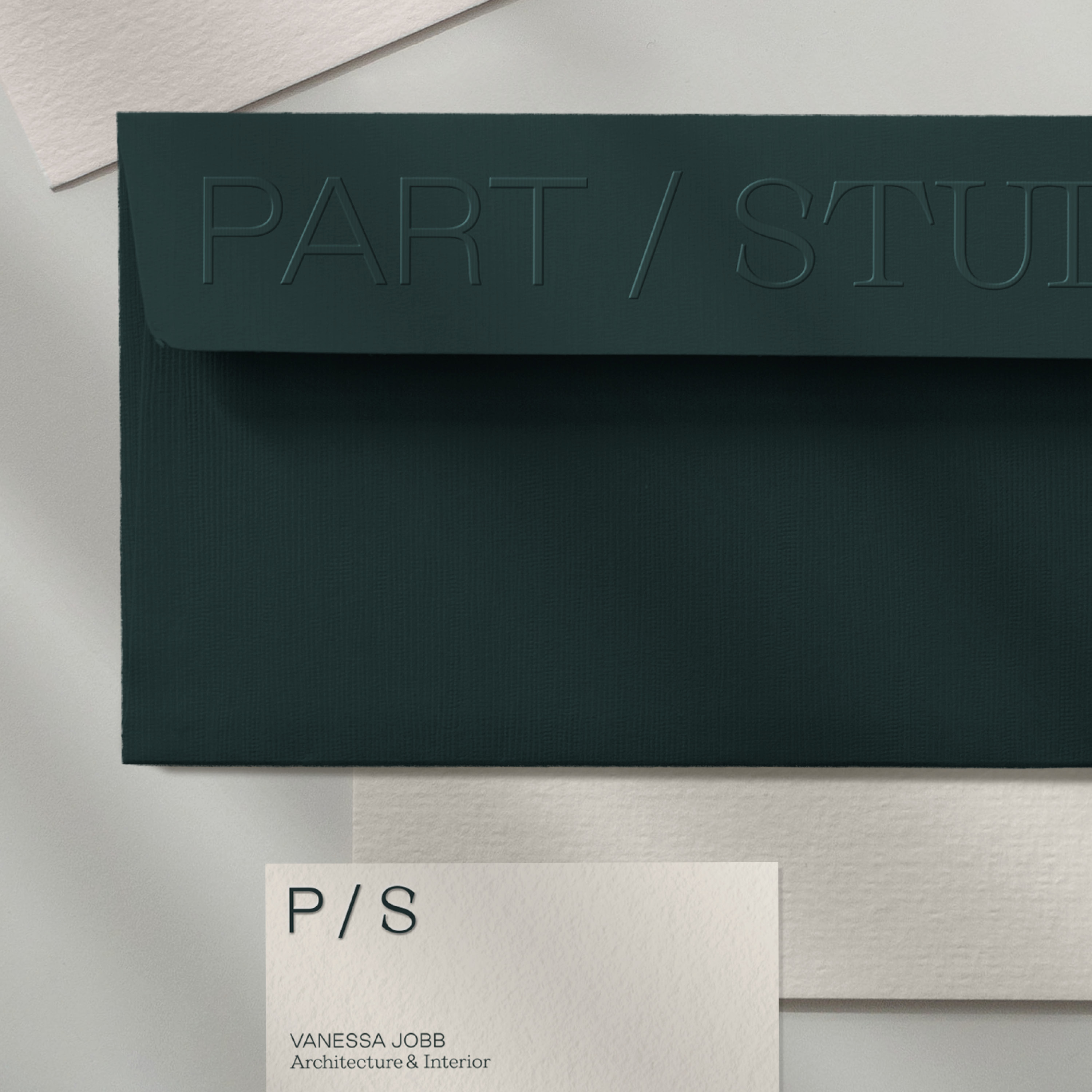
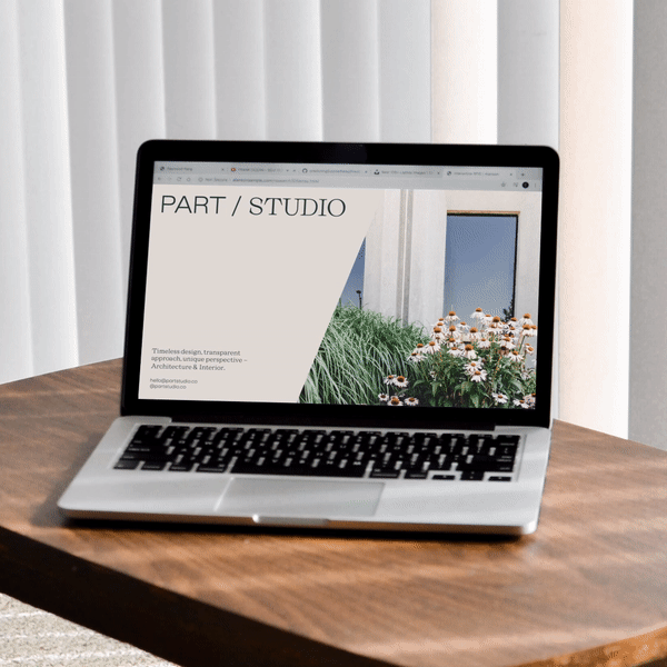
CONTEXT
Part Studio is a boutique architecture and interior design firm in London, led by part-time model and architect Vanessa Jobb. The studio's name reflects Vanessa’s dual passions—fashion and design—and her split time between these two worlds. This concept became the visual foundation of the brand, resulting in a logo that seamlessly blends both serif and sans-serif typefaces. To add flexibility and variety, a distinct icon was also created.
The muted, natural color palette draws inspiration from Vanessa's Irish heritage and her appreciation for the contrast between light and dark tones.
The muted, natural color palette draws inspiration from Vanessa's Irish heritage and her appreciation for the contrast between light and dark tones.