SESSIONS ARTS CLUB
Credit: SODA Studio
Design: Katie Stamp, Andrew Fish
3D: Matt Gilbert
Finishing: Dot Studio
Website: Katie Stamp
Brand Identity – Art Direction – Stationery – Menu Design
Credit: SODA Studio
Design: Katie Stamp, Andrew Fish
3D: Matt Gilbert
Finishing: Dot Studio
Website: Katie Stamp
Brand Identity – Art Direction – Stationery – Menu Design
CONTEXT
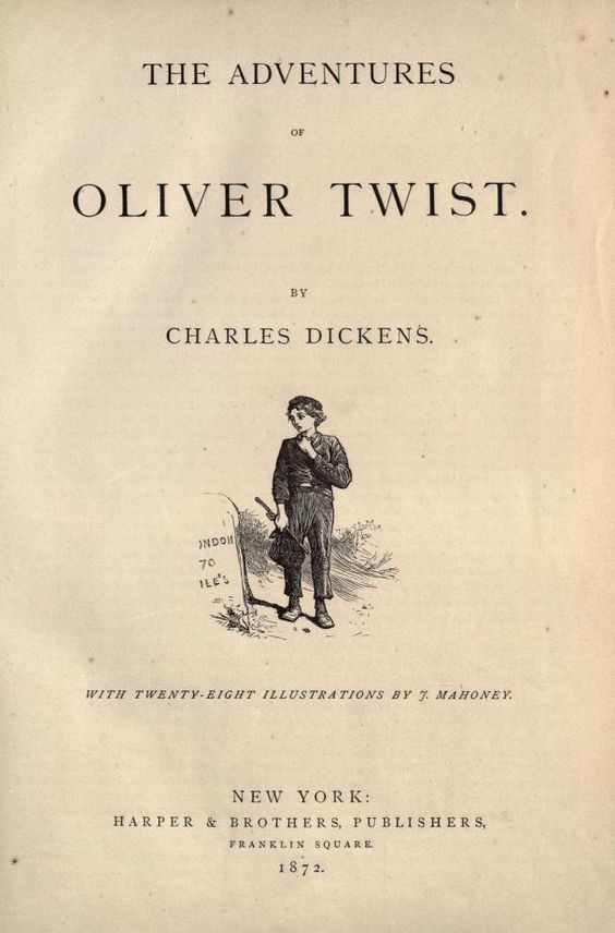
Nestled within the historic, Grade II* listed Old Sessions House, Sessions Arts Club offers an immersive sensory experience, blending food, music, design, and architecture. The restaurant’s identity is deeply intertwined with the building’s rich history, dating back to 1782 when it opened as Middlesex Sessions House, once the largest courthouse in the country. Charles Dickens himself referenced it in Oliver Twist, recounting the pickpocketing that occurred on its steps.
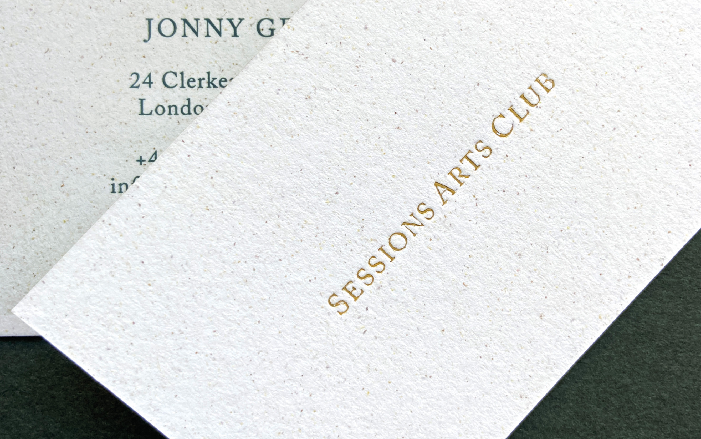
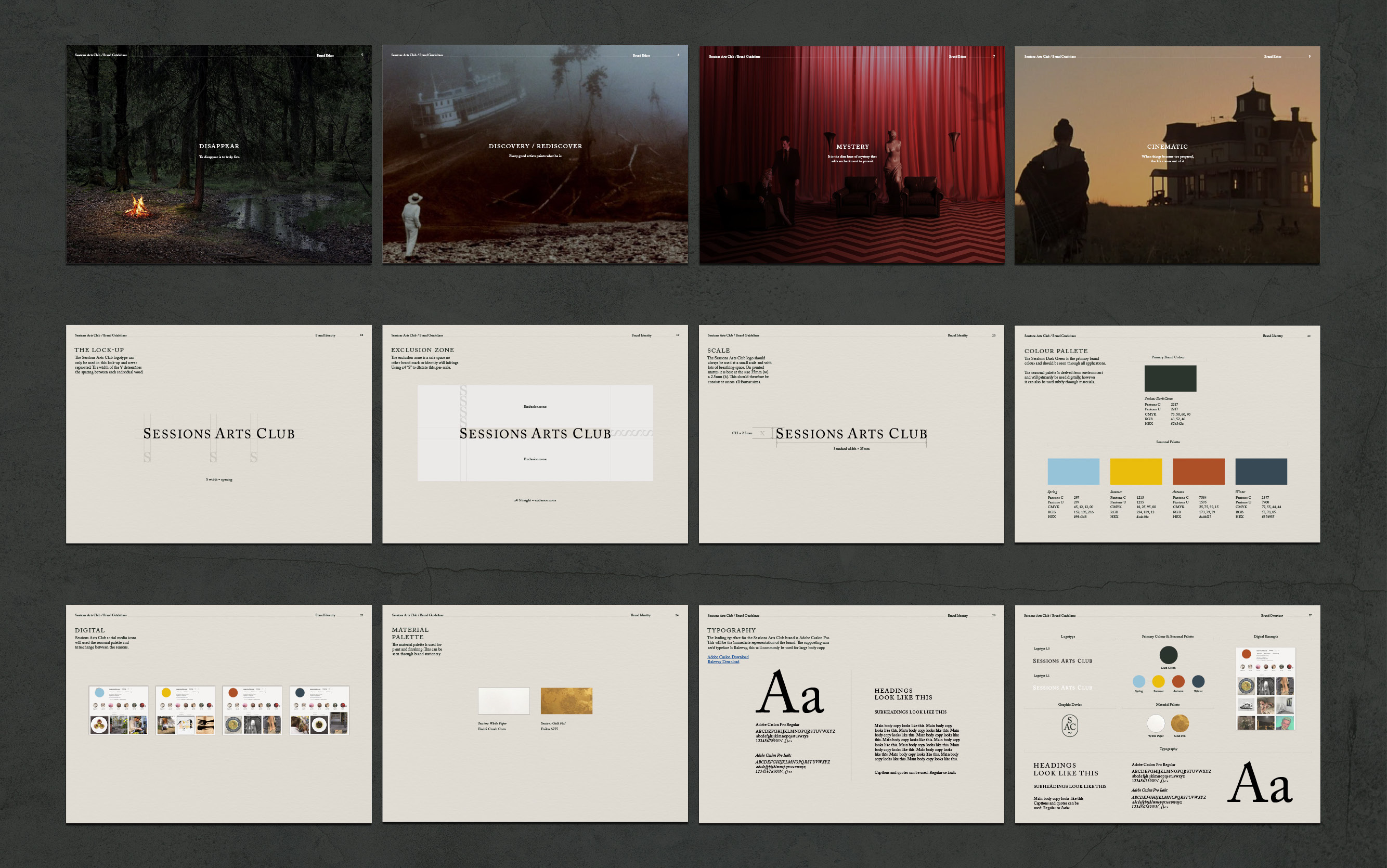
To honour this heritage, SAC’s wordmark draws inspiration from the typesetting of Dickens’ novel, using the classic serif font Caslon in uppercase to evoke a timeless quality. Alongside the wordmark, we developed a monogram that serves as a more discreet and abstract symbol for the restaurant, embodying its subtle elegance. The monogram, with its understated form, becomes a mark that is quietly woven into the visual identity, enhancing the sense of discovery that SAC is known for.
This hidden charm is central to the SAC brand. Much like the restaurant itself, tucked away within Clerkenwell, the brand mark can be found hidden in plain sight for those keen enough to look. It’s a nod to the mystery and allure that runs through both the branding and the experience SAC offers.


MORE
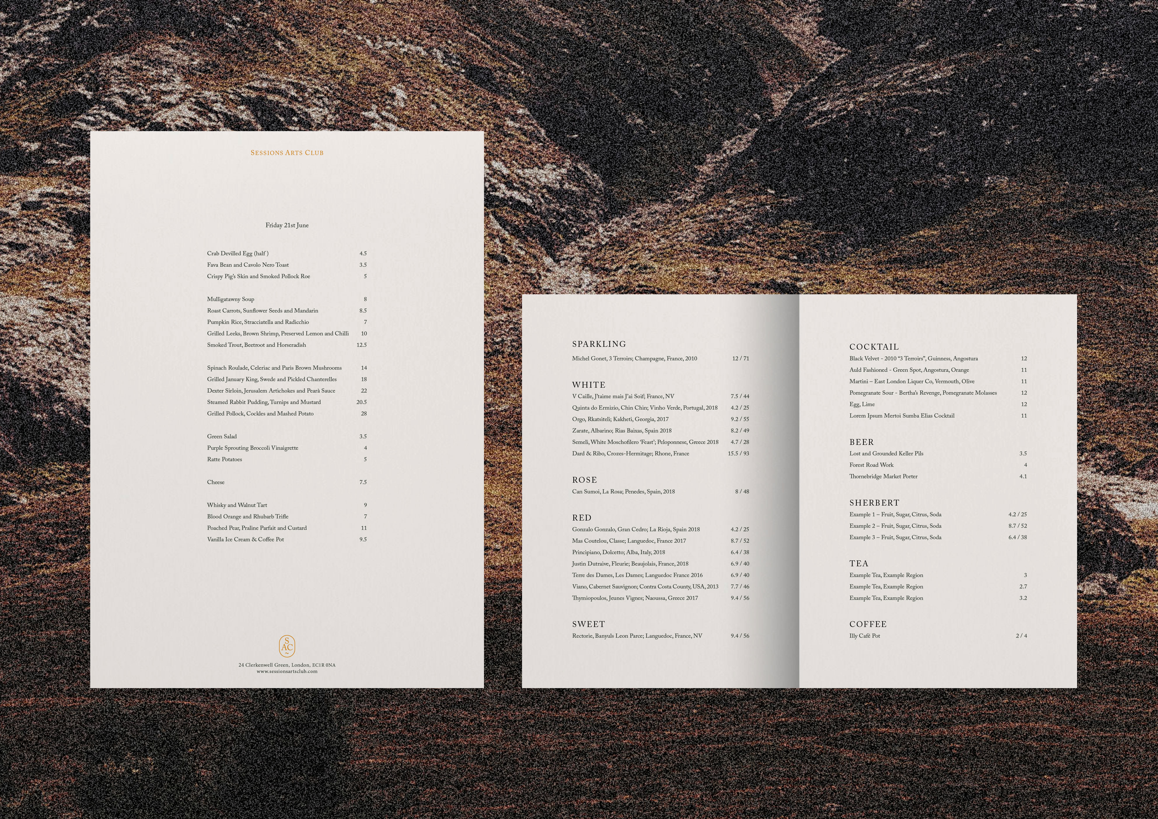
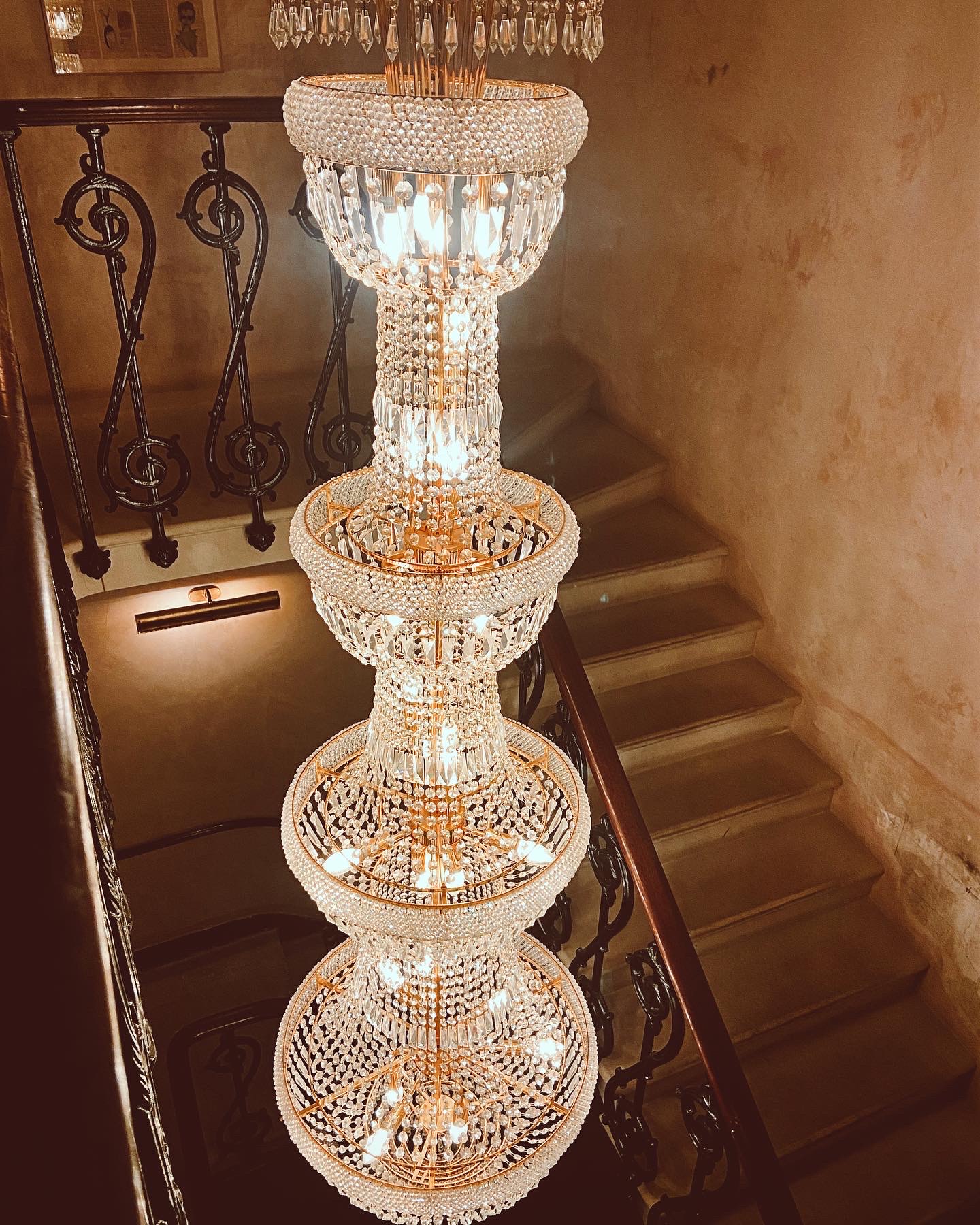
In keeping with the restaurant’s celebration of the arts, all collateral and wayfinding at Sessions Arts Club was crafted using traditional, artisanal techniques. The menus were elevated with the timeless sophistication of antique gold foil blocking, adding a touch of elegance that aligns with the venue’s historic surroundings. Meanwhile, the signage was meticulously hand-painted, infusing the space with a bespoke quality that transforms every corner into a work of art.
These thoughtful details not only honour the building’s legacy but also enhance the overall atmosphere, turning the restaurant into a living, breathing masterpiece where design, craftsmanship, and history converge.
These thoughtful details not only honour the building’s legacy but also enhance the overall atmosphere, turning the restaurant into a living, breathing masterpiece where design, craftsmanship, and history converge.