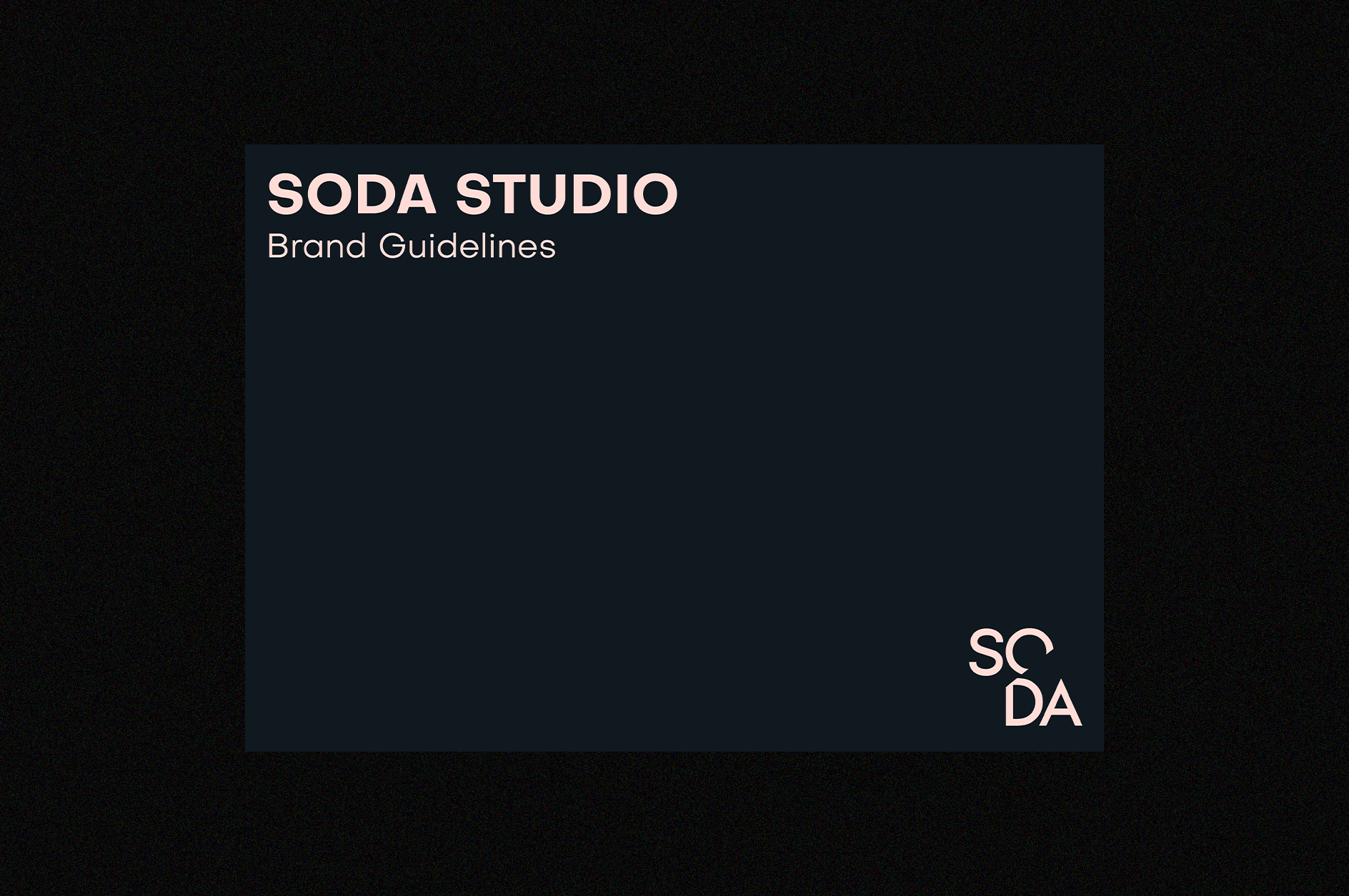
SODA STUDIO
Design: Katie Stamp, Andrew Fish
Brand Identity – Art Direction – Stationery – Website
Awards: Archiboo Awards, Best Visual Design
Brand Impact Awards, Self Branded
Design: Katie Stamp, Andrew Fish
Brand Identity – Art Direction – Stationery – Website
Awards: Archiboo Awards, Best Visual Design
Brand Impact Awards, Self Branded
CONTEXT
Originally brought on to reposition the business, the goal was to transform SODA from a traditional architecture practice into a multidisciplinary design studio with a full 360º offering. This shift informed the development of the brand strategy, identity, and website, reflecting SODA’s evolution and future direction.
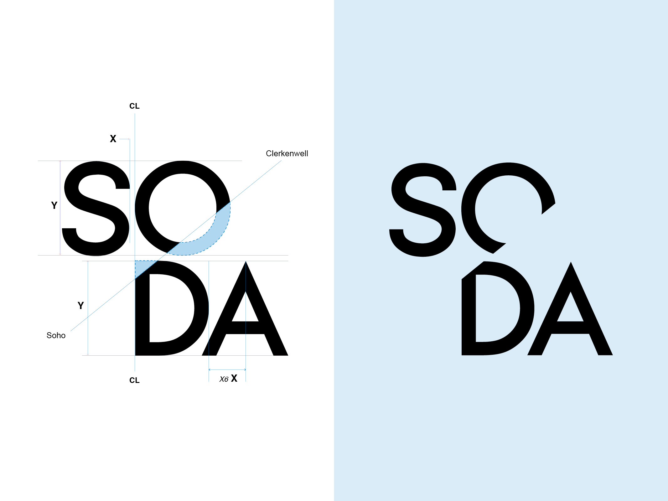
The wordmark itself tells a story, connecting the journey from their original Soho location to their new studio in Clerkenwell. The 51.5º angle embedded within the logo symbolises this geographic and creative shift, grounding the brand in both its history and its forward-thinking approach.
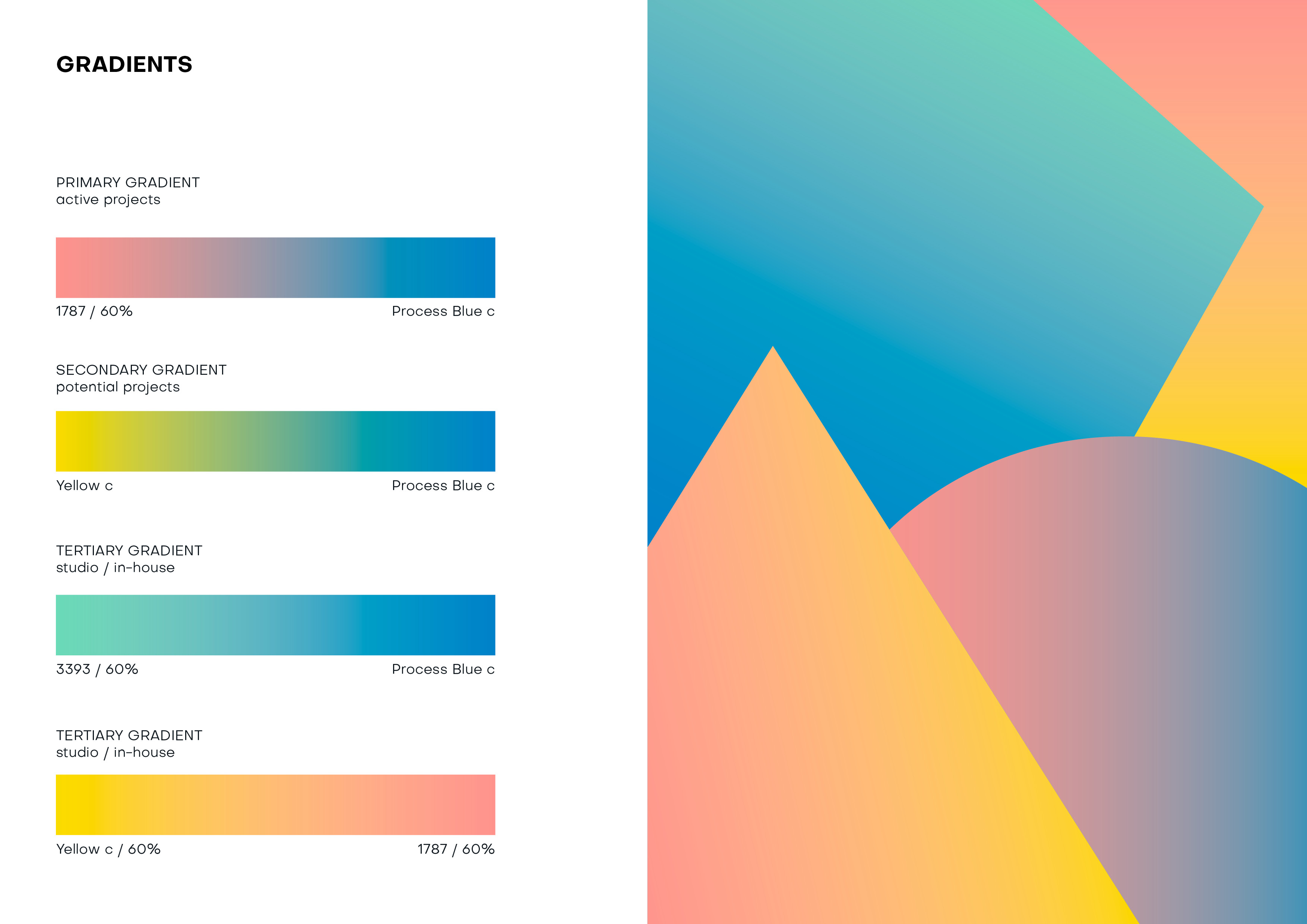
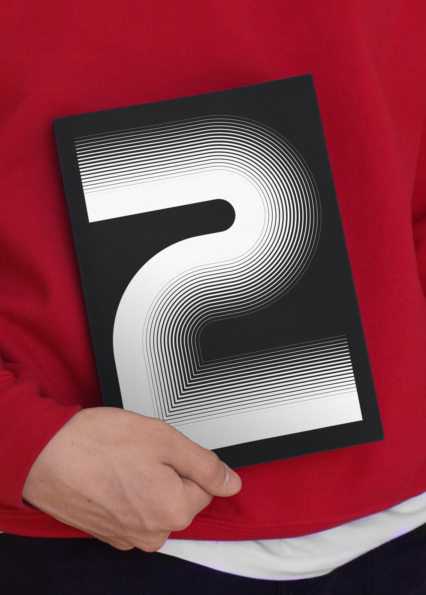
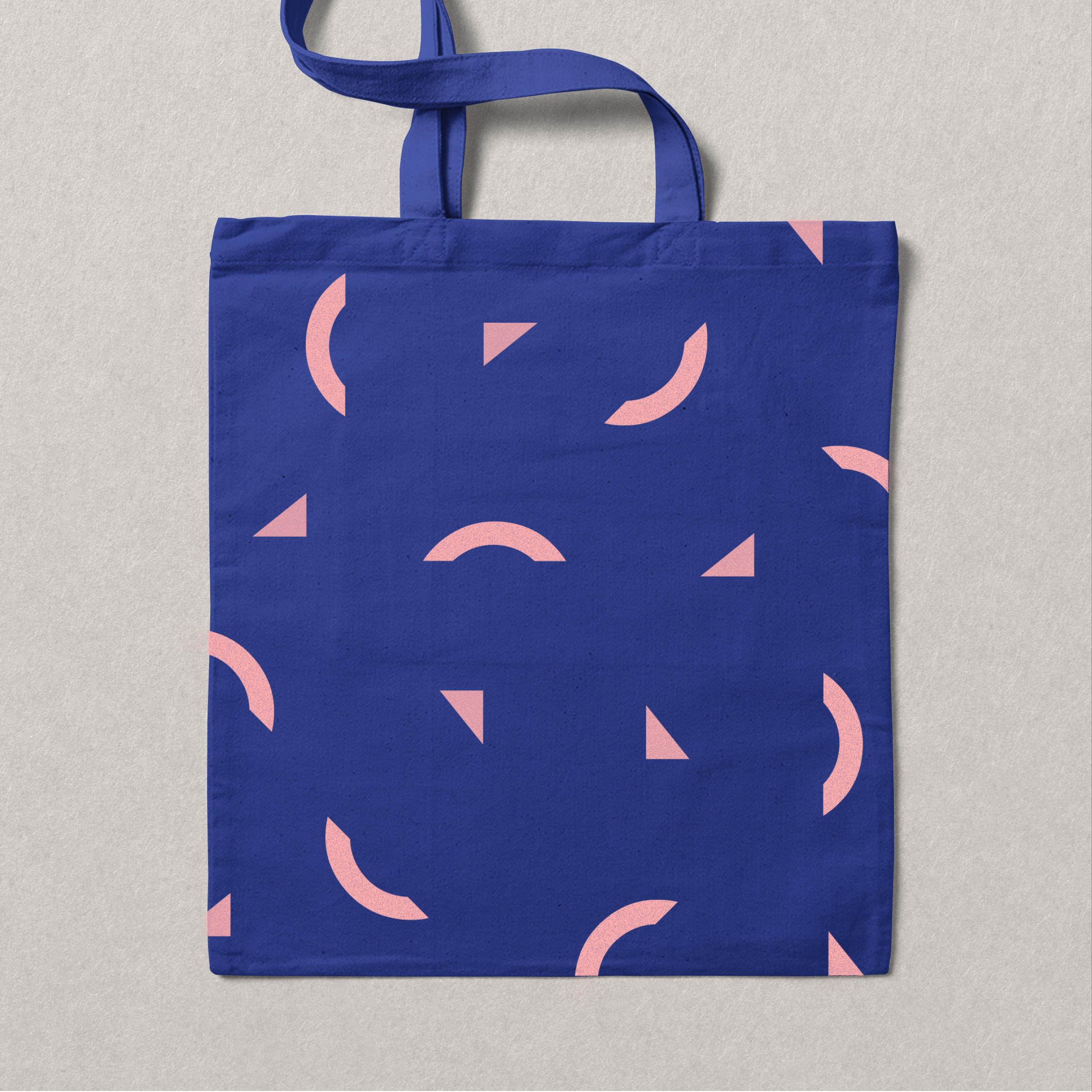
SODA’s commitment to design inspired a playful yet thoughtful use of the logo’s elements. Rather than discard the offcuts of the "O" and "D", we repurposed them into a series of patterns and icons, adding depth and personality to the brand. This not only created visual interest but also reinforced SODA’s ethos of rethinking and reusing materials—much like their architectural practice.
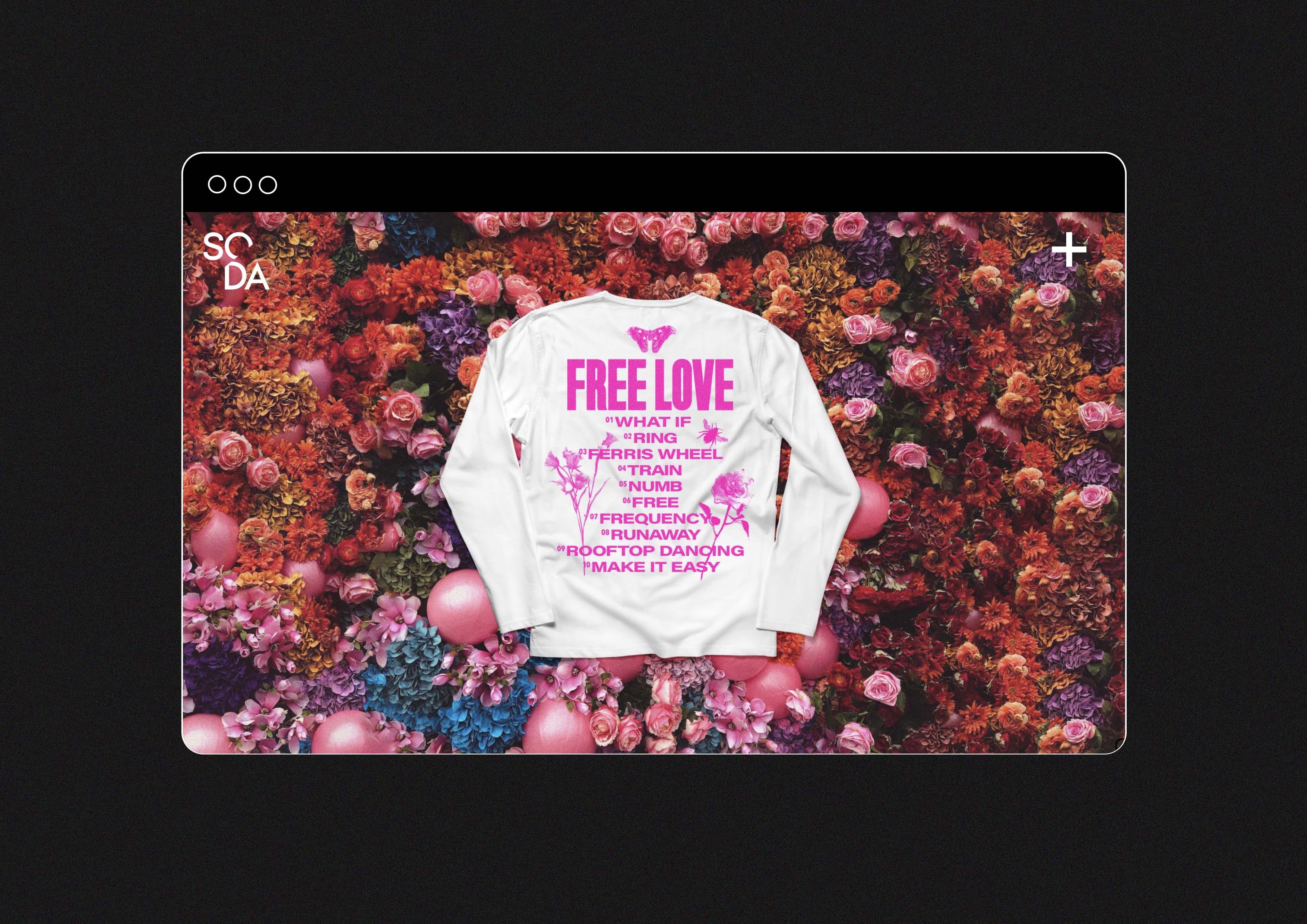
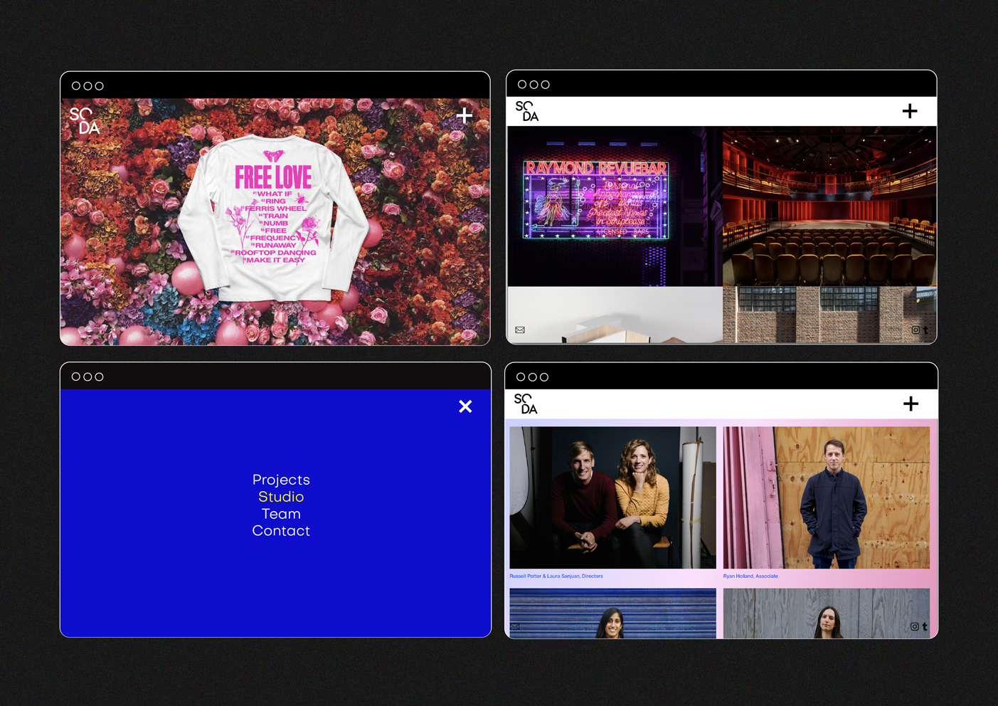
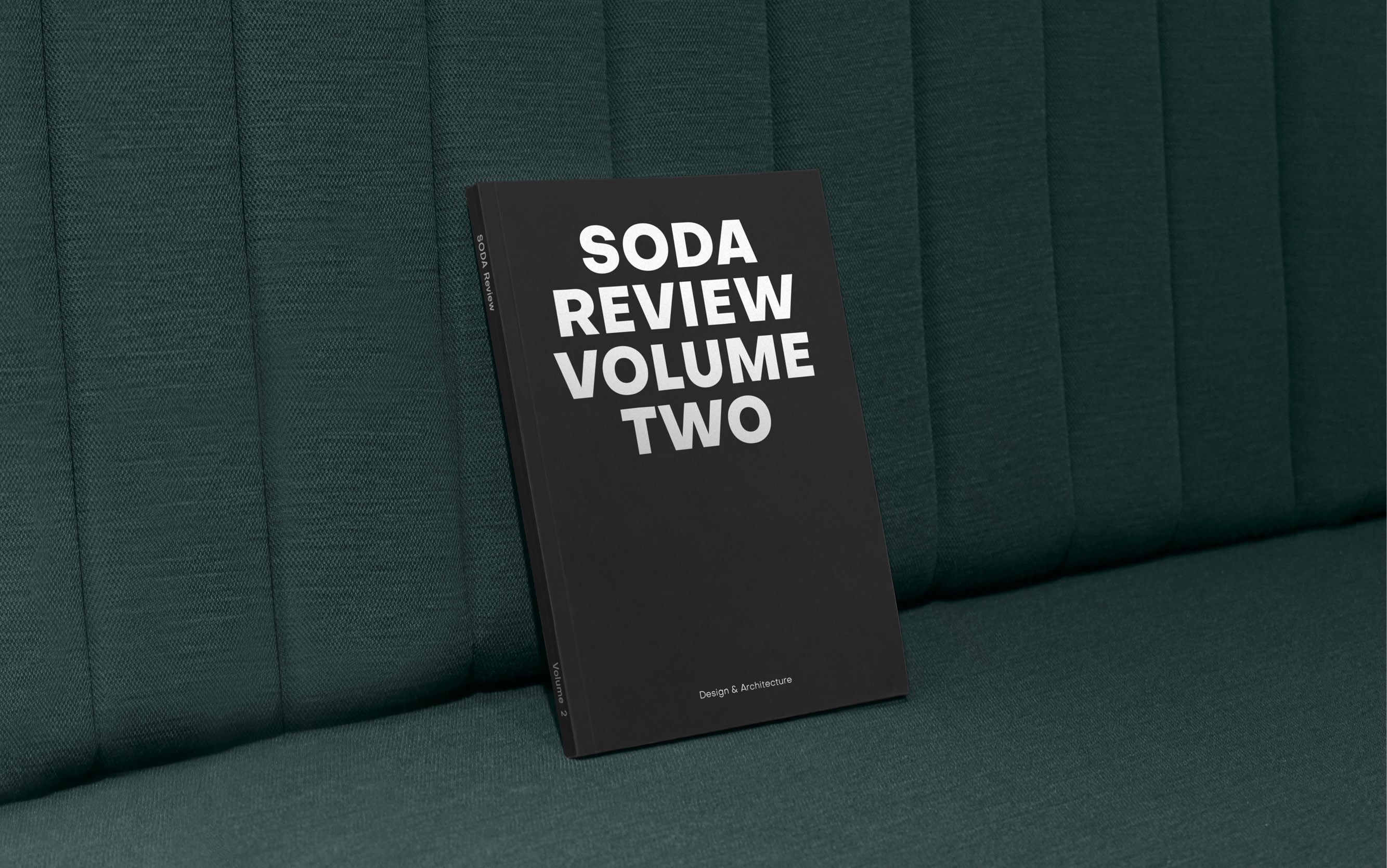
As the partnership grew, I collaborated with SODA to expand their offering by developing a graphic design arm within the previously architecture-only studio. Every year, we produced the SODA Review, an annual publication that showcases the studio’s projects.
The wordmark itself tells a story, connecting the journey from their original Soho location to their new studio in Clerkenwell. The 51.5º angle embedded within the logo symbolises this geographic and creative shift, grounding the brand in both its history and its forward-thinking approach.
SODA’s commitment to design inspired a playful yet thoughtful use of the logo’s elements. Rather than discard the offcuts of the "O" and "D", we repurposed them into a series of patterns and icons, adding depth and personality to the brand. This not only created visual interest but also reinforced SODA’s ethos of rethinking and reusing materials—much like their architectural practice.
As the partnership grew, I collaborated with SODA to expand their offering by developing a graphic design arm within the previously architecture-only studio. Every year, we produced the SODA Review, an annual publication that showcases the studio’s projects.